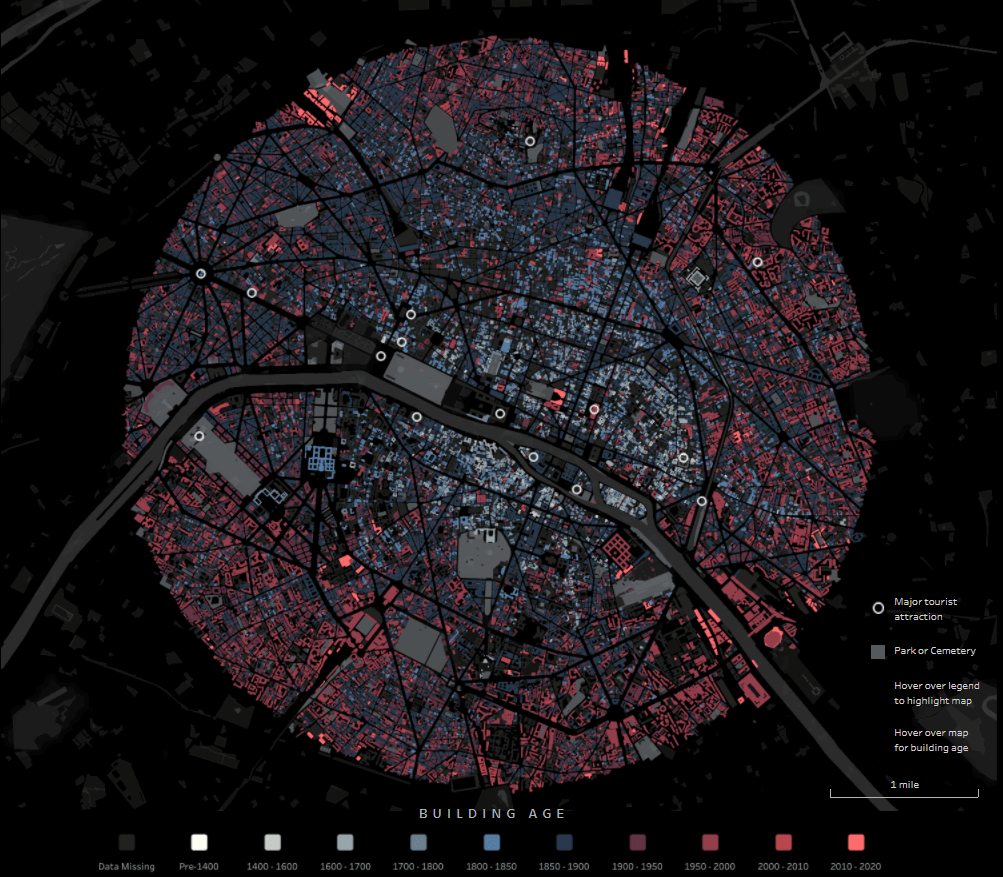
Through the exellent newsletter quantum of sollazzo by Giuseppe Sollazzo (@puntofisso) I learned of the beautiful map of Paris by Naresh Suglani (@SuglaniNaresh), where Suglani have visualised the year of construction in a lovely blue-to-red colour gradient. It is a stunning visualisation, and I immediately wanted to try to make a similar version myself.
Here you can see Suglani’s original:
In order to recreate this map I needed to get my hands on 1) the shapes of buildings in Copenhagen and 2) the year of construction.
The shape of buildings
Dataforsyningen is part of the Danish Agency for Data Supply and Efficiency, and they offer a range of datasets. One of them is the dataset INSPIRE – Bygninger. This dataset follows the INSPIRE directive by the European Union, which promotes the standardisation of the infrastructure for geographical data in Europe. The file contains polygons of the shape of buildings, which is what I needed. The file format is GML, which you can read about here.
This is a rather big file, because it is not possible to filter which part of Denmark you are interested in.

The age of the buildings
Unfortunately, the GML file does not contain a “date of construction” attribute, so I had to find that elsewhere.
From my current workplace, I know of a dataset called “BBR”, which stands for Bygnings- og Boligregistret (Building- and Housing Registry). This dataset contains information about housing plots, buildings, facilities etc. in a point format. I had a strong suspicion that BBR includes information about the year of construction, so I downloaded the dataset from Dataforsyningen, just like the buildings-dataset. This dataset is called INSPIRE – BBR bygninger og boliger, and comes in the geopackage file format (.gpkg).
Once again, we get a rather large file:

I open the file and — we are in luck! The point-file contains an attribute called “dateofcons” aka date of construction.
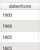
However, one thing stood out: Several buildings had the date of construction as the year 1000. Now I am no history major, but that seemed like a bit of a stretch. So I asked around, and it turns out that the BBR-dataset use the value 1000 as their “unknown” category. Not the most ideal choice in my opinion, but that’s how it is. Therefore I had to filter out the 1000-values in the dateofcons column for my visualisation.
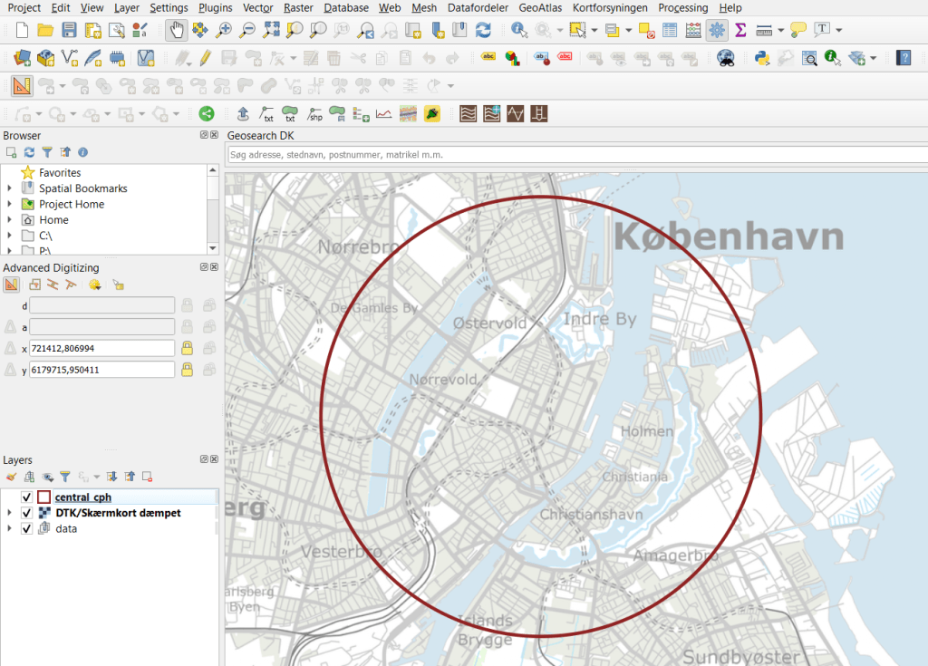
Clipping the data
To follow the design of Suglani, I focused on central Copenhagen. I created a circular polygon encompassing most of the old town of central Copenhagen to use to clip the two datasets.
Then I was ready to clip the data to fit my circle:
And here are the results:

Next I needed to join the two datasets somehow, so that each building could have an attribute with its year of construction. For this I needed to do a join attributes by location.
By doing this kind of join I assumed that both datasets are near-perfect, i.e. that all buildings are registered at a high level of detail, and that the position of the BBR-points will not fall out of the building polygons. That is a large assumption to make, and there will probably be some errors. Let’s have a closer look at how well the two datasets match:
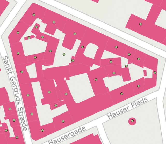
I would say this is an excellent fit, although there is at least one BBR-point which seems to be floating in the air, with no building-polygon nearby.
I ran the join tool, waited a few minutes, and voilá!
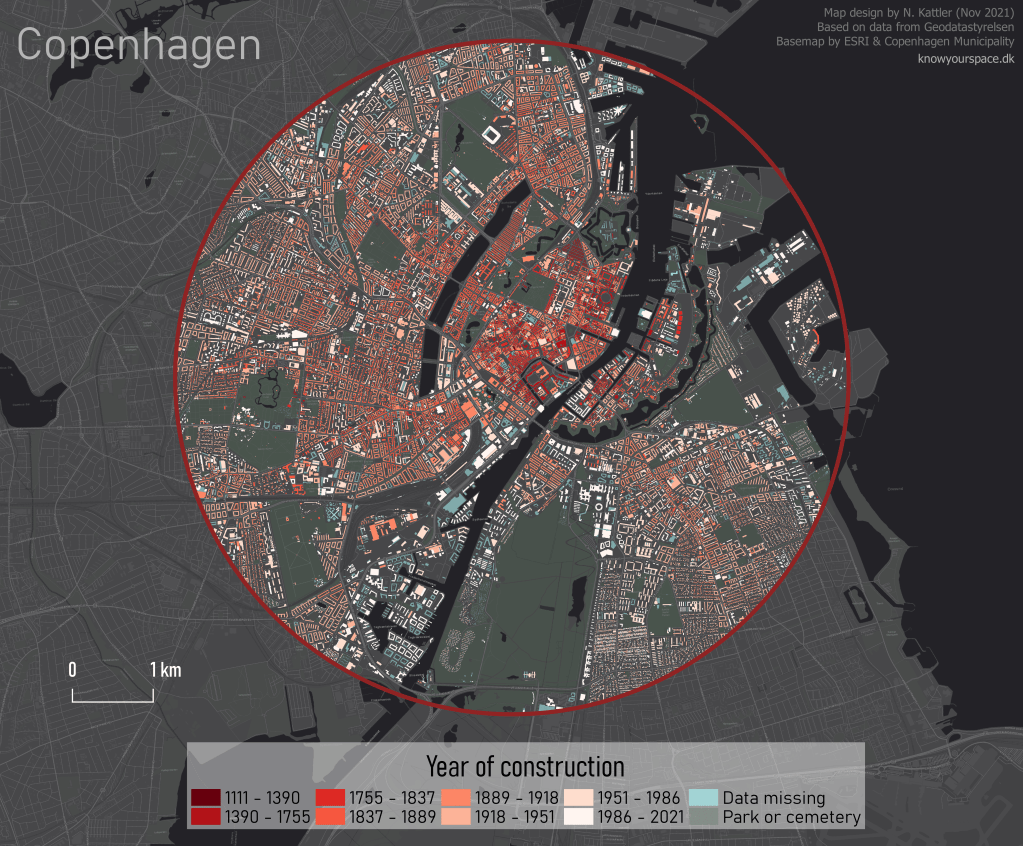
Not as elegant or interactive as Suglani’s original version, but I’m pretty satisfied!
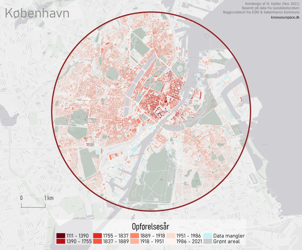
I also made a light version in Danish:

Great job Nina! 👏
LikeLiked by 1 person
Hi Nina, awesome GIS visualization work. One can really see the old infrastructural backbone of copenhagen, around christianhaven and left of it. Hope it will survive gentrification nowadays as it has done the last hundred years!
Bst Rgds
LikeLiked by 1 person
Det er et interessant kort, men måske kunne inddelingen i årsintervaller optimeres. I stedet for at dele ved 1755 og 1837 burde inddelinger ved 1728, 1795 og 1852 få byens historie til at fremstå lidt tydeligere. Altså ved de to store bybrande og afskaffelsen af demarkationslinjen.
LikeLike
God ide!
Jeg er ikke en haj til Københavns historie, så jeg tillod mig at bruge metoden “natural breaks” til at skabe årsintervallerne. Algoritmen splitter selv årrækkerne i nogle intervaller som virker “naturlige” baseret på antallet af huse og deres årstal. Derfor kan det godt virke som en lidt tilfældig inddeling.
Mvh Nina
LikeLike