Rectangles are the most common shape of maps in GIS software, but why stop there?
In GIS software like ArcGIS Pro, it is possible to create map layouts in non-rectangular shapes without too much hassle. But that is not the case in QGIS (yet!), so let’s look at ways to make creative map shapes in QGIS.
In this post, I explain how to download a Sentinel 2 image from the Copernicus Open Access Hub. I want to use this image to make some unique map-layouts.
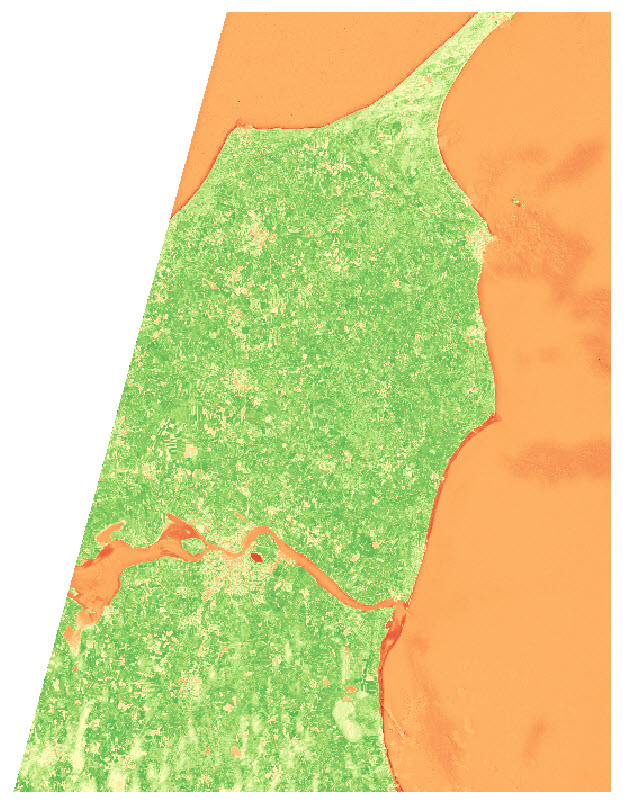
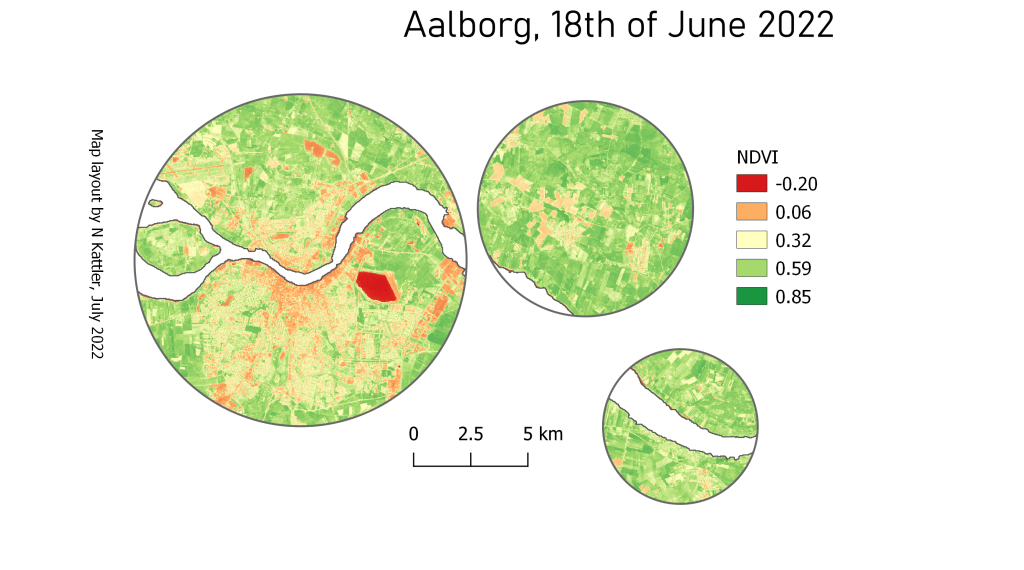
I want to make an NDVI map, so I take the NIR and Red bands from the image (band 8 and 4), add them to QGIS, and use the Raster Calculator to make an NDVI image
I use the latest country-border polygon from GADM to clip the raster layer
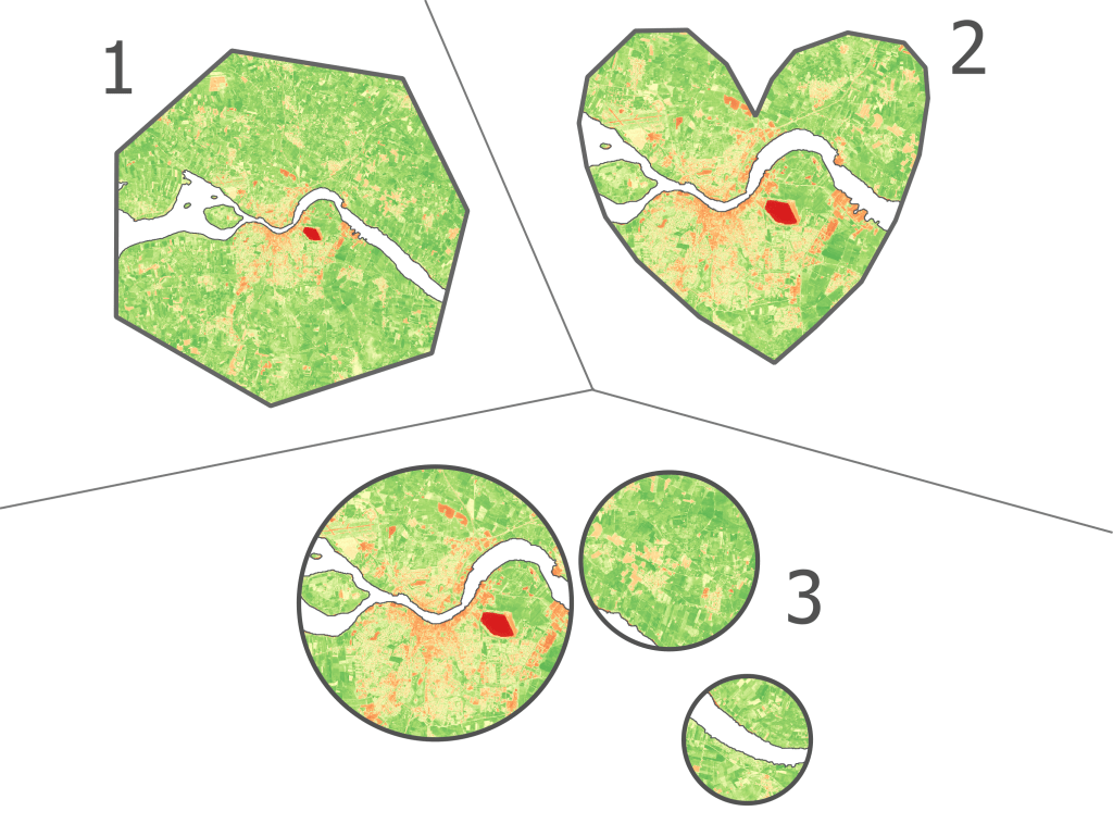
I want to show the NDVI data of the area near the city of Aalborg, in some different shapes.
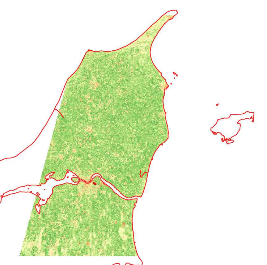
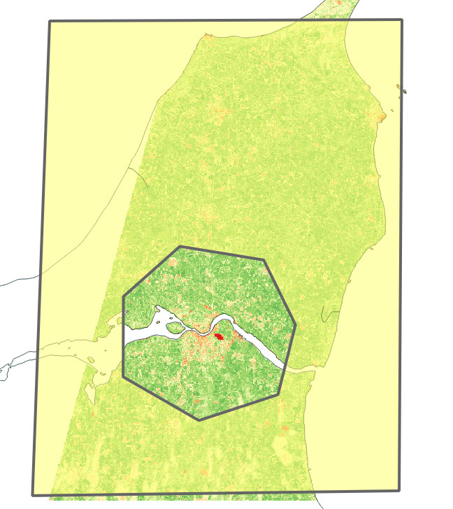
I start by creating two polygon layers, and create a big polygon in one layer and a small polygon (near Aalborg) in the second layer . The small polygon is the one that will define the layout, so get creative!
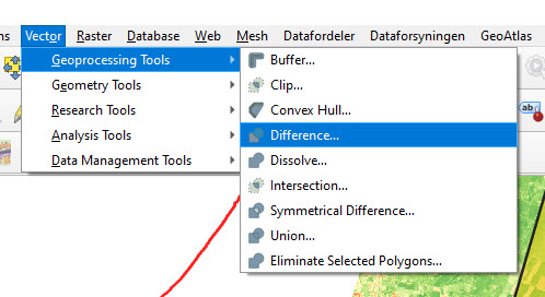
I use the Difference tool in QGIS to cut out the shape of the small polygon in the large polygon.
The outcome looks something like this:
Depending on your creative skills, you can make some cool shapes. You can also import a pre-made polygon and use that instead.
Here are the 3 versions I ended up with:
You can also add some of the classical map elements
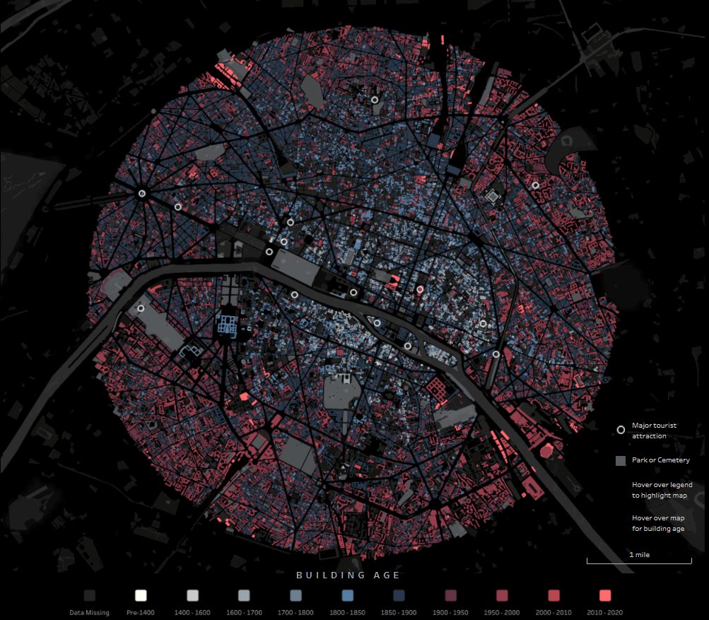
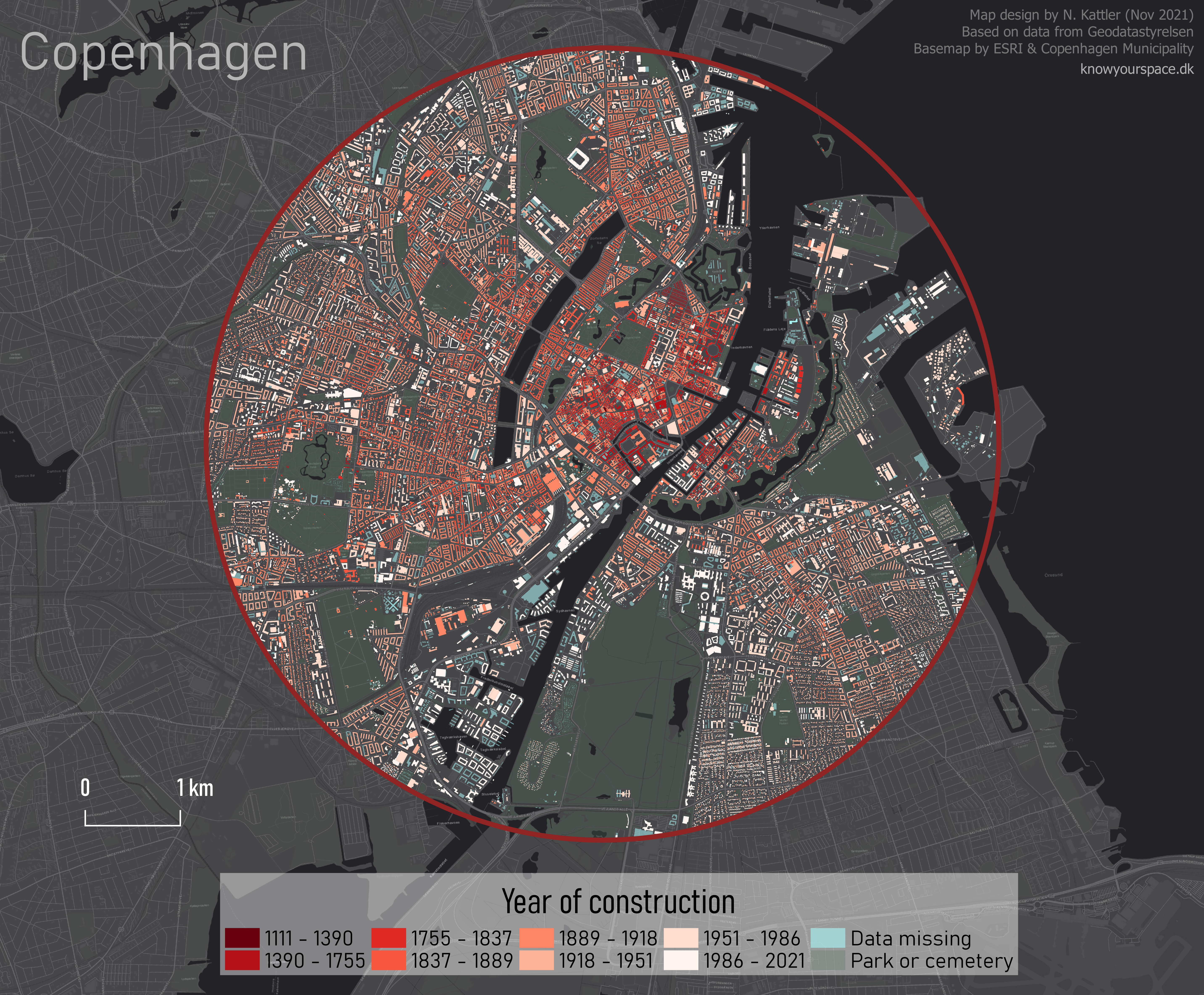
Through the exellent newsletter quantum of sollazzo by Giuseppe Sollazzo (@puntofisso) I learned of the beautiful map of Paris by Naresh Suglani (@SuglaniNaresh), where Suglani have visualised the year of construction in a lovely blue-to-red colour gradient. It is a stunning visualisation, and I immediately wanted to try to make a similar version myself.
Here you can see Suglani’s original:
“Paris | Building Ages” by Naresh Suglani. September 2021.
In order to recreate this map I needed to get my hands on 1) the shapes of buildings in Copenhagen and 2) the year of construction.
The shape of buildings
Dataforsyningen is part of the Danish Agency for Data Supply and Efficiency, and they offer a range of datasets. One of them is the dataset INSPIRE – Bygninger. This dataset follows the INSPIRE directive by the European Union, which promotes the standardisation of the infrastructure for geographical data in Europe. The file contains polygons of the shape of buildings, which is what I needed. The file format is GML, which you can read about here.
This is a rather big file, because it is not possible to filter which part of Denmark you are interested in.
The age of the buildings
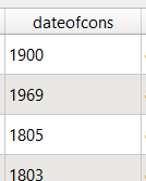
Unfortunately, the GML file does not contain a “date of construction” attribute, so I had to find that elsewhere.
From my current workplace, I know of a dataset called “BBR”, which stands for Bygnings- og Boligregistret (Building- and Housing Registry). This dataset contains information about housing plots, buildings, facilities etc. in a point format. I had a strong suspicion that BBR includes information about the year of construction, so I downloaded the dataset from Dataforsyningen, just like the buildings-dataset. This dataset is called INSPIRE – BBR bygninger og boliger, and comes in the geopackage file format (.gpkg).
Once again, we get a rather large file:
I open the file and — we are in luck! The point-file contains an attribute called “dateofcons” aka date of construction.
However, one thing stood out: Several buildings had the date of construction as the year 1000. Now I am no history major, but that seemed like a bit of a stretch. So I asked around, and it turns out that the BBR-dataset use the value 1000 as their “unknown” category. Not the most ideal choice in my opinion, but that’s how it is. Therefore I had to filter out the 1000-values in the dateofcons column for my visualisation.
Clipping the data
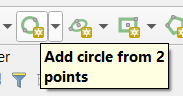
To follow the design of Suglani, I focused on central Copenhagen. I created a circular polygon encompassing most of the old town of central Copenhagen to use to clip the two datasets.
Then I was ready to clip the data to fit my circle:
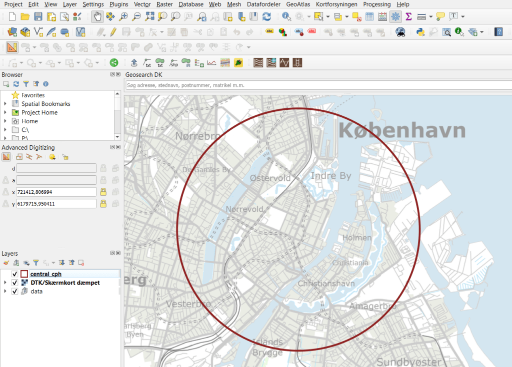
And here are the results:
Building polygons to the left, BBR points on the right.
Next I needed to join the two datasets somehow, so that each building could have an attribute with its year of construction. For this I needed to do a join attributes by location.
By doing this kind of join I assumed that both datasets are near-perfect, i.e. that all buildings are registered at a high level of detail, and that the position of the BBR-points will not fall out of the building polygons. That is a large assumption to make, and there will probably be some errors. Let’s have a closer look at how well the two datasets match:
I would say this is an excellent fit, although there is at least one BBR-point which seems to be floating in the air, with no building-polygon nearby.
I ran the join tool, waited a few minutes, and voilá!
Back in December 2018, I was in Yangon (Myanmar) to help facilitate a workshop on satellite-based remote sensing to support water professionals in the country. For this workshop, I created a script to calculate a time series for surface soil moisture, evapotranspiration and precipitation.
The data for this script are:
Large Scale International Boundary Polygons (USDOS/LSIB/2017)
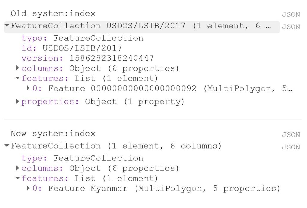
The first thing to do is to load the shapefile of Myanmar, using the LSIB dataset. We need to deal with the auto generated system:index, which otherwise causes some visualisation issues later on. The auto generated ID for the Feature could be something like 000000000000000092.
My solution is a bit of a ‘hack’, because in this specific case, I only have a single Feature in my FeatureCollection, i.e. the shapefile of Myanmar. That means that I can use .first() and .set() to change the system:index of the single Feature. In this instance, I change the system:index to Myanmar.
// Select country from list
var countries = ee.FeatureCollection("USDOS/LSIB/2017");
var fc = countries.filter(ee.Filter.inList('COUNTRY_NA',['Burma']));
print('Old system:index', fc);

// Change system:index from the auto generated name
var feature = ee.Feature(fc.first().set('system:index', 'Myanmar')); // .first() is used as there is just one Feature
var Myanmar = ee.FeatureCollection(feature);
print('New system:index', Myanmar);

// Add Myanmar and center map
Map.centerObject(Myanmar);
Map.addLayer(Myanmar, {}, 'Myanmar shapefile');
This gives the following output:
Now I load the imageCollections of the three datasets.
// Filter datasets for bands and period
var SSM = ee.ImageCollection('NASA_USDA/HSL/SMAP_soil_moisture')
      .select('ssm')
      .filterBounds(Myanmar)
      .filterDate(startdate, enddate);

var ET = ee.ImageCollection('MODIS/006/MOD16A2')
      .select('ET')
      .filterBounds(Myanmar)
      .filterDate(startdate, enddate);

var PRCP = ee.ImageCollection('UCSB-CHG/CHIRPS/DAILY')
      .select('precipitation')
      .filterBounds(Myanmar)
      .filterDate(startdate, enddate);
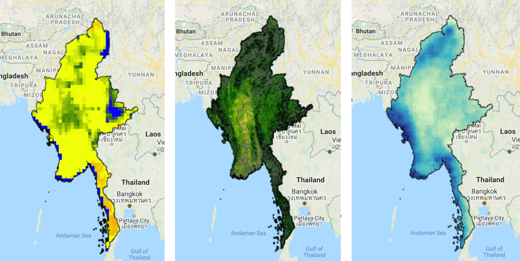
Next, I create a single image consisting of the mean of each imageCollection for the given time period. This is purely for visualisation purposes as you will see next.
// Calculate means for visualisation
var SSM_mean = SSM.mean()
  .clip(Myanmar);

var ET_mean = ET.mean()
  .clip(Myanmar);

var PRCP_mean = PRCP.mean()
  .clip(Myanmar);
I set the visualisation parameters, and add the data to my map.
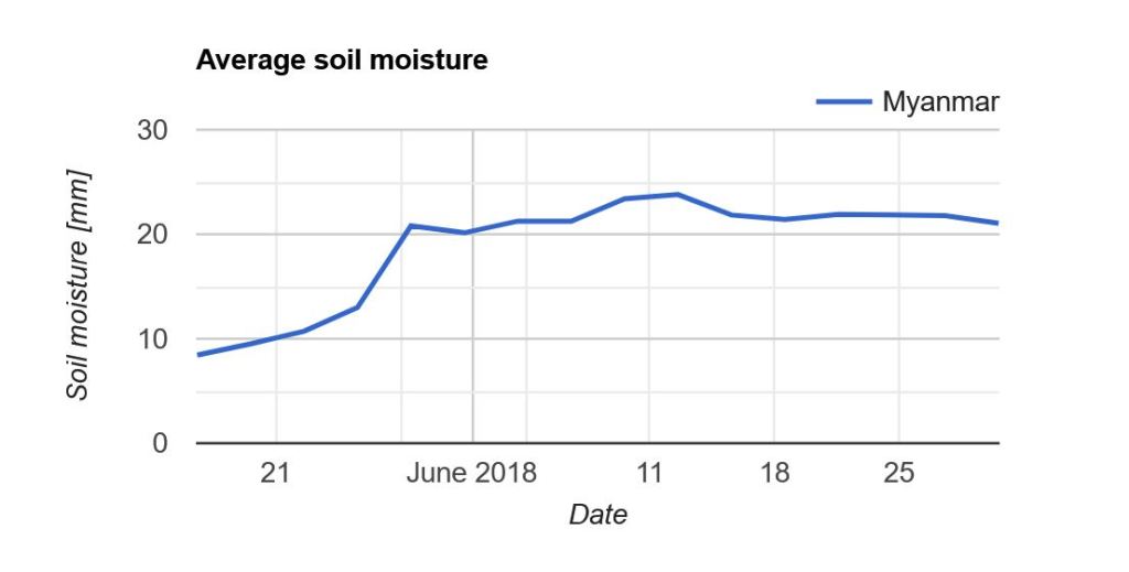
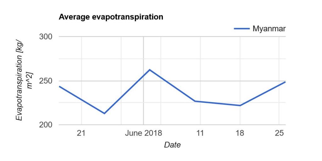
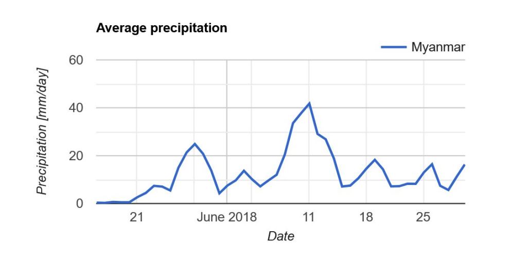
Now what we really want is a graph showing the development of the data through time. Due to the limited memory capacity of Google Earth Engine, I can’t get more than 1.5 month of data, but that is enough to have a look at the onset of the monsoon season in May/June.
I use the ui.Chart.image.seriesByRegion where the arguments are: imageCollection, regions, reducer, band, scale, xProperty, seriesProperty (last four are optional). In addition, I use .setOptions() to add a main title and axis titles.
Note that “Myanmar” appears in the legend of the graph. If we had not changed the system:index in the beginning, you would instead see something like “000000000000000092“.
Here I will post examples of maps and other images that I have created. Feel free to ask about how certain elements were created, and I can make a post about it.
I will update this post when I have new content to show.
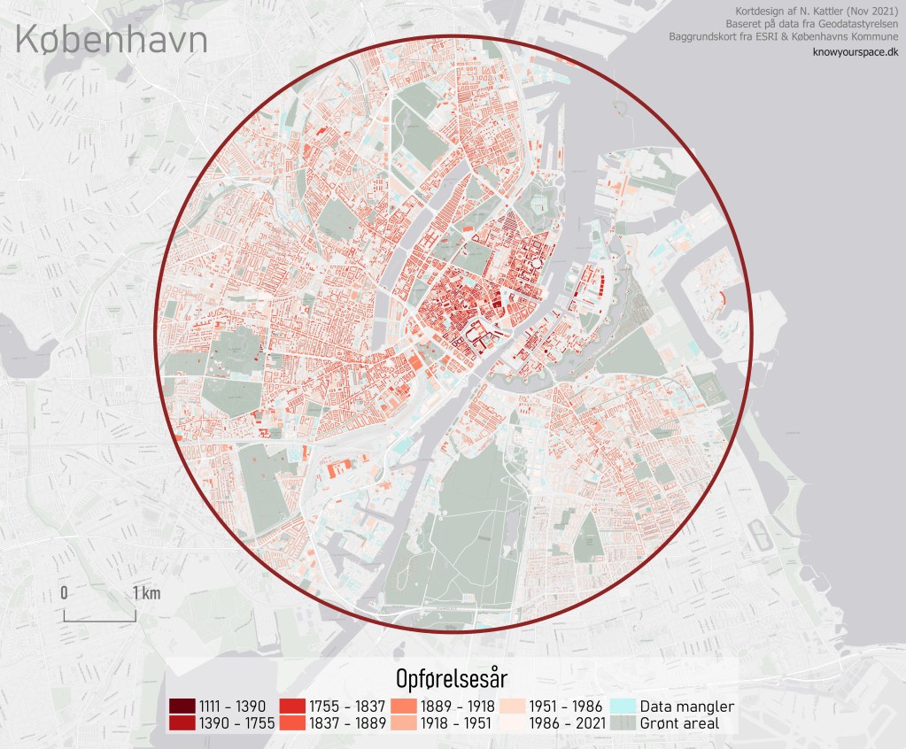
English and Danish version of a map showing the year of construction of buildings in the Danish capital, Copenhagen. Created using QGIS 3.10. Read about how I made the map here.
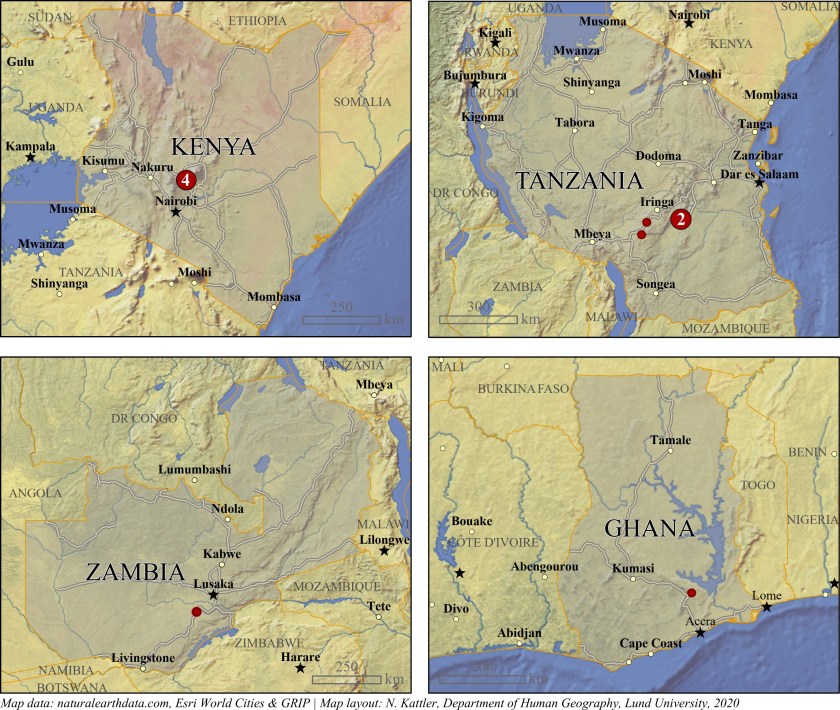
Locations of villages in a study. Created using ArcGIS Pro.
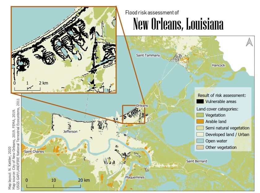
Areas vulnerable to floods in New Orleans, Louisiana. Created using QGIS.
Soil moisture, evapotranspiration and precipitation. Created using Google Earth Engine.
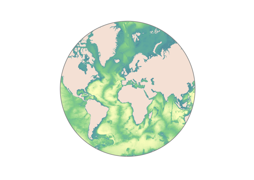
Seafloor bathymetry. Created using ArcGIS Pro.
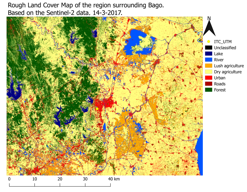
Supervised land classification based on Sentinel 2 data. Created using QGIS.
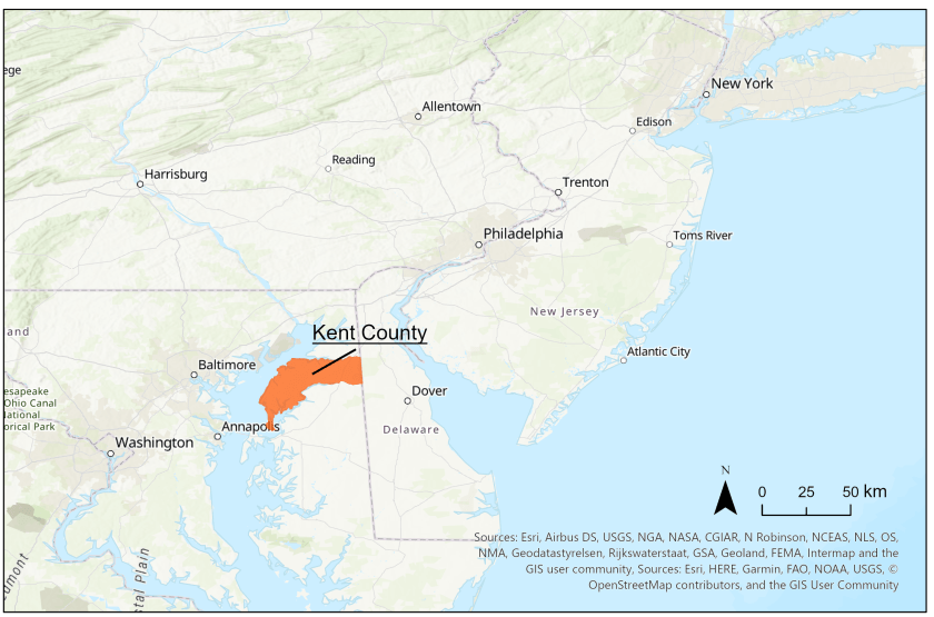
Kent County, Maryland. Created using ArcGIS Pro.
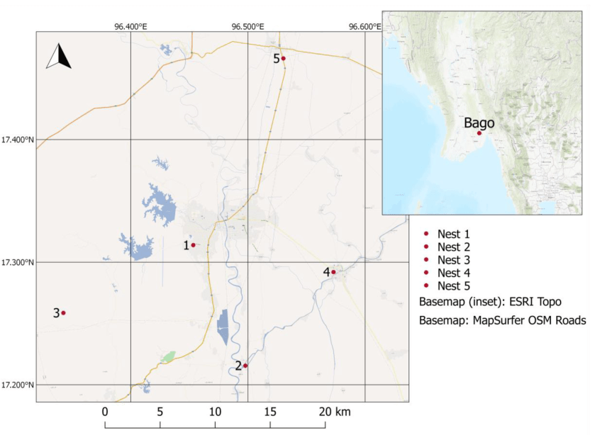
Sensor locations in Bago region, Myanmar, with an inset map. Created using QGIS.
We found a strange looking geological formation while looking at our Malawi data. It pops up very clear in our VanderSat soil moisture observations. We first thought it was a meteor crater but we are not sure. Any suggestions? #soilmoisture#satellites#water#nocloudspic.twitter.com/f4LNRJzyJ5