I realise that I am a bit late to the party, but I just noticed the paper by Mladenova et al (2020) which outlines a new SMAP-based soil moisture dataset, where the resolution is increased from 0.25°x0.25° (roughly 27-28km at the equator) to 10km by “assimilating soil moisture retrievals from the Soil Moisture Active Passive (SMAP) mission into the USDA-FAS Palmer model“.
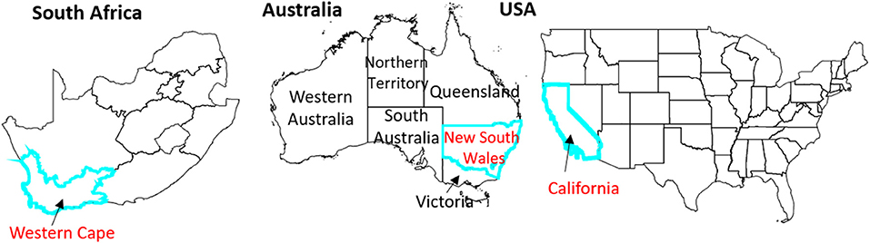
The researchers tested the new dataset in three areas: California (USA), the Western Cape (South Africa) and New South Wales (Australia), as all three areas experienced a drought since the SMAP satellite has been operational.
Study area for the Mladenova et al (2020) paper
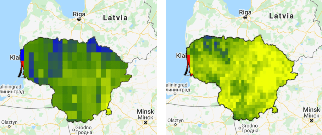
Soil moisture is an often overlooked dataset, especially due to the often terribly low spatial resolution. Perhaps this enhanced dataset will result in an increased usage of the data. The increased spatial resolution is, in my opinion, a big improvement:
0.25°x0.25° SMAP image compared to the 10x10km enhanced SMAP image. Here I used Lithuania used an example, with data from 2017-2018.
As you can guess from the two images above, the enhanced dataset is available on Google Earth Engine.
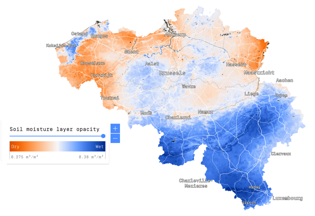
If you want to see the (to my knowledge) only high-resolution soil moisture product in existence, check out the Dutch remote sensing company VanderSat. Their product is based on passive microwaves, and has a spatial resolution of just 100m.
Back in December 2018, I was in Yangon (Myanmar) to help facilitate a workshop on satellite-based remote sensing to support water professionals in the country. For this workshop, I created a script to calculate a time series for surface soil moisture, evapotranspiration and precipitation.
The data for this script are:
Large Scale International Boundary Polygons (USDOS/LSIB/2017)
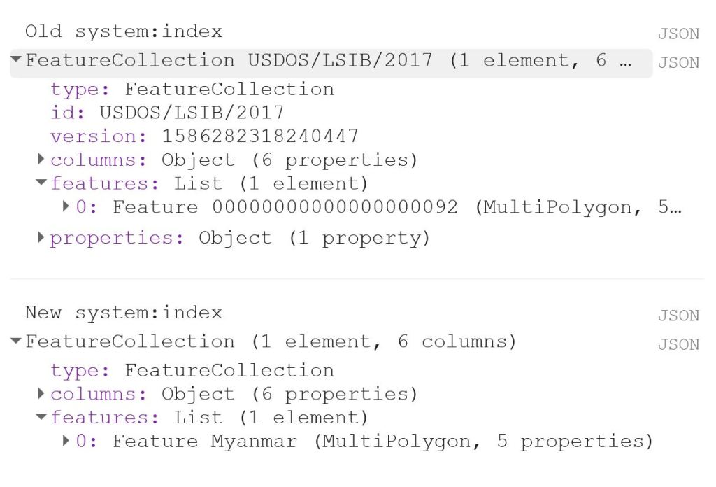
The first thing to do is to load the shapefile of Myanmar, using the LSIB dataset. We need to deal with the auto generated system:index, which otherwise causes some visualisation issues later on. The auto generated ID for the Feature could be something like 000000000000000092.
My solution is a bit of a ‘hack’, because in this specific case, I only have a single Feature in my FeatureCollection, i.e. the shapefile of Myanmar. That means that I can use .first() and .set() to change the system:index of the single Feature. In this instance, I change the system:index to Myanmar.
// Select country from list
var countries = ee.FeatureCollection("USDOS/LSIB/2017");
var fc = countries.filter(ee.Filter.inList('COUNTRY_NA',['Burma']));
print('Old system:index', fc);

// Change system:index from the auto generated name
var feature = ee.Feature(fc.first().set('system:index', 'Myanmar')); // .first() is used as there is just one Feature
var Myanmar = ee.FeatureCollection(feature);
print('New system:index', Myanmar);

// Add Myanmar and center map
Map.centerObject(Myanmar);
Map.addLayer(Myanmar, {}, 'Myanmar shapefile');
This gives the following output:
Now I load the imageCollections of the three datasets.
// Filter datasets for bands and period
var SSM = ee.ImageCollection('NASA_USDA/HSL/SMAP_soil_moisture')
      .select('ssm')
      .filterBounds(Myanmar)
      .filterDate(startdate, enddate);

var ET = ee.ImageCollection('MODIS/006/MOD16A2')
      .select('ET')
      .filterBounds(Myanmar)
      .filterDate(startdate, enddate);

var PRCP = ee.ImageCollection('UCSB-CHG/CHIRPS/DAILY')
      .select('precipitation')
      .filterBounds(Myanmar)
      .filterDate(startdate, enddate);
Next, I create a single image consisting of the mean of each imageCollection for the given time period. This is purely for visualisation purposes as you will see next.
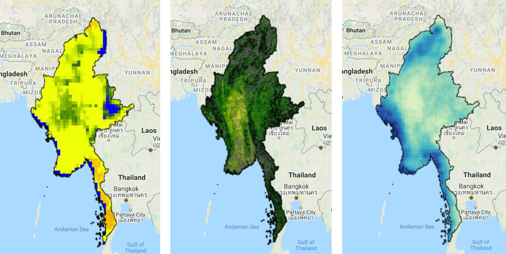
// Calculate means for visualisation
var SSM_mean = SSM.mean()
  .clip(Myanmar);

var ET_mean = ET.mean()
  .clip(Myanmar);

var PRCP_mean = PRCP.mean()
  .clip(Myanmar);
I set the visualisation parameters, and add the data to my map.
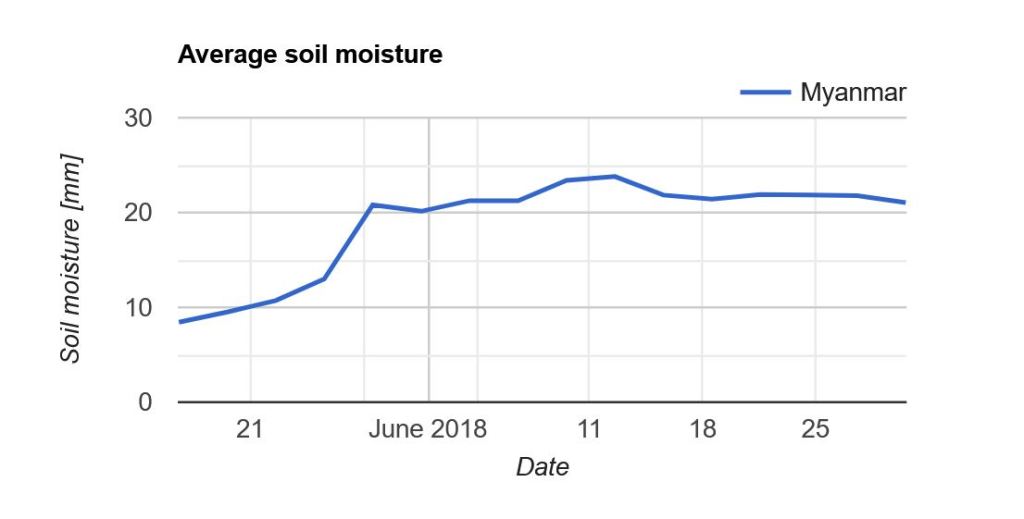
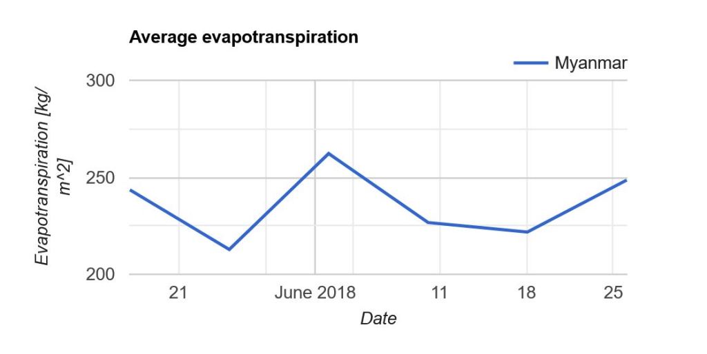
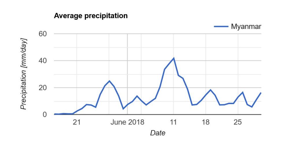
Now what we really want is a graph showing the development of the data through time. Due to the limited memory capacity of Google Earth Engine, I can’t get more than 1.5 month of data, but that is enough to have a look at the onset of the monsoon season in May/June.
I use the ui.Chart.image.seriesByRegion where the arguments are: imageCollection, regions, reducer, band, scale, xProperty, seriesProperty (last four are optional). In addition, I use .setOptions() to add a main title and axis titles.
Note that “Myanmar” appears in the legend of the graph. If we had not changed the system:index in the beginning, you would instead see something like “000000000000000092“.