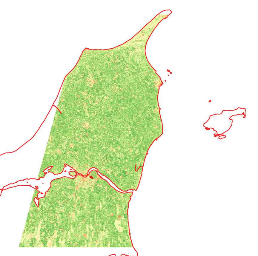
To run this script, you must have uploaded a shapefile to your Google Earth Engine account (an “Asset”). In my case, I am using the administrative borders for Tanzania. This dataset comes in three different levels. You can find that kind of data in the GADM database (version 3.6).
// Import administrative borders and select the gadm level
// (0=country, 1=region, 2=district, 3=ward)
var gadm_level = '1';
var area = ee.FeatureCollection('users/username/gadm36_TZA_'+gadm_level);
print('area', area);
Map.centerObject(area, 6);
Map.addLayer(area, {}, 'area');
Next, you set the date of the period that you are interested in.
// Set the date
var year = '2019'
var startdate = year+'-01-01';
var enddate = year+'-12-31';

print(startdate)
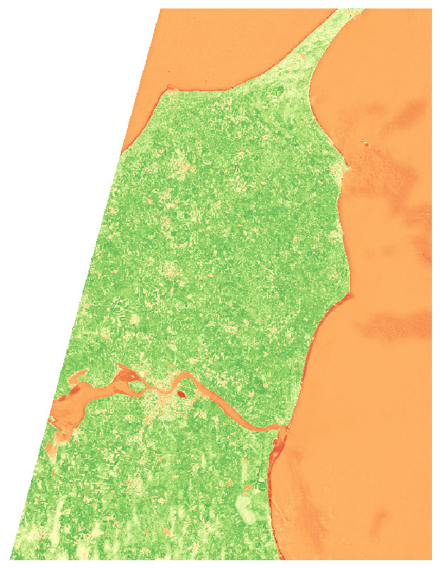
Now I load in the NDVI data. Here I use the 250m resolution, 16-day Vegetation Indices product from MODIS (MOD13Q1.006). This dataset has a pre-calculated NDVI band, so I don’t have to first do the calculation to NDVI from the NIR/Red bands. However, in Earth Engine, the scale is 0.0001, so we need to correct that scale to get values in the order that we are used to deal with (from -1 to 1).
// MODIS NDVI scale is 0.0001, so we need to correct the scale
var NDVI = function(image) {
  return image.expression('float(b("NDVI")/10000)')
};

var modis = ee.ImageCollection('MODIS/006/MOD13Q1')
  .filterBounds(area)
  .filterDate(startdate,enddate);

// Now we select only the NDVI from the list of bands
var modisNDVI = modis.map(NDVI)
print('MODIS after .map', modisNDVI)
Now we have the variable modisNDVI which is an ImageCollection. The ImageCollection contains a list of images that are within the start date and end date that we have specified in the beginning.
Now we’ll create a mosaic from this ImageCollection. You can read more about what a mosaic is here.
var mosaic = modisNDVI.mosaic()
  .clip(area);
print('mosaic', mosaic);
Another thing we could have done is to take the mean:
var mean = modisNDVI.mean()
  .clip(area);
print('mean', mean);
However, at least in my case, this takes much longer to compute.
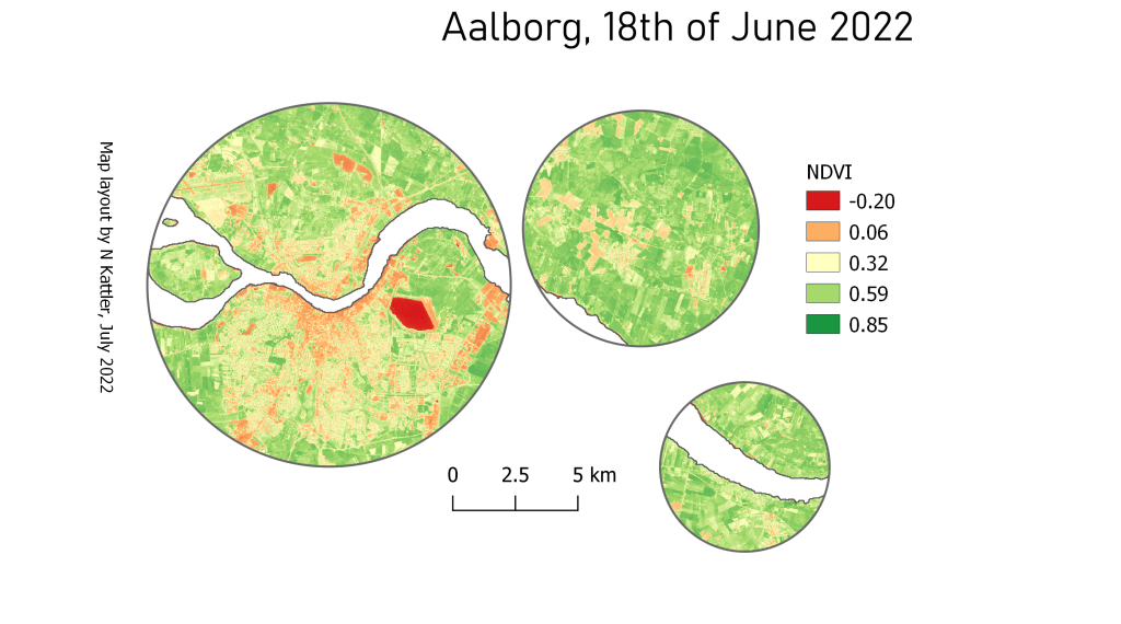
Next, we set the visualisation parameters and add the mosaic to the map.
// Set visualisation parameters
var colour = {
 min: 0.0,
 max: 1.0,
 palette: [
 'FFFFFF', 'CE7E45', 'DF923D', 'F1B555', 'FCD163', '99B718', '74A901',
 '66A000', '529400', '3E8601', '207401', '056201', '004C00', '023B01',
 '012E01', '011D01', '011301'
 ],
};

Map.addLayer(mosaic, colour, 'spatial mosaic');
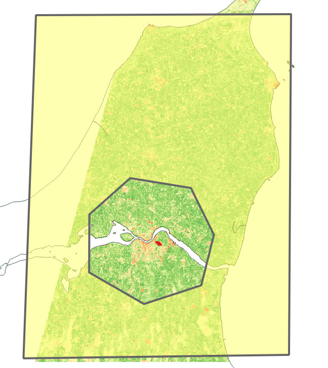
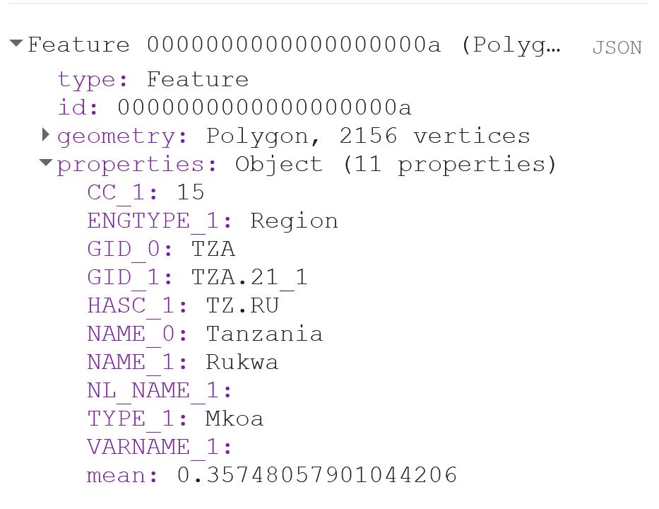
Now I use reduceRegions to get a value for each polygon (or region) in the shapefile. Remember that the scale should represent the spatial resolution of the dataset. Print out the result of the first polygon to make sure that you now have a column called “mean”.
// Add reducer output to the Features in the collection.
var MeansOfFeatures = mosaic.reduceRegions({
  collection: area,
  reducer: ee.Reducer.mean(),
  scale: 250,
});

print(ee.Feature(MeansOfFeatures.first()))
That should look something like this:
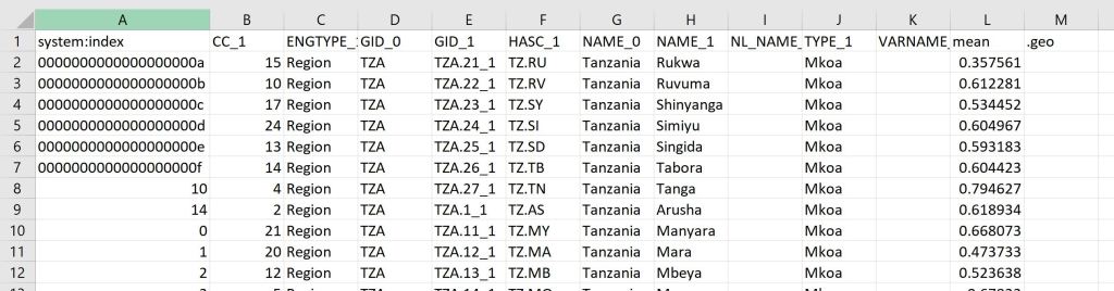
If you export the Feature now, you will notice that you get a column called “.geo“, which can become quite annoying if you are working with Excel, or just want your output to look nice. The .geo column contains the geometry, i.e. the XY coordinates, of each and every point of each and every polygon. This takes up a lot of space and is usually not data that you are interested in.
The user Rodrigo E. Principe gave a simple solution to get rid of the .geo-column in this post on StackExchange:
// Remove the content of .geo column (the geometry)
var featureCollection = MeansOfFeatures.map(function(feat){
  var nullfeat = ee.Feature(null)
  return nullfeat.copyProperties(feat)
})
Now we can export our output:
// Export the featureCollection (table) as a CSV file to your Google Drive account
Export.table.toDrive({
  collection: featureCollection,
  description: 'modis250_ndvi_TZA_adm'+gadm_level+'_'+year,
  folder: 'GEE output',
  fileFormat: 'CSV'
});
Your output will look something like this:
You can see the code in its entirety here.