Let’s say there is a specific spatial event that you are interested in, for example the volcanic eruption in Tonga on January 15th in 2022.
For this example I will use data from publicly available polar orbiting satellites. These kind of satellites only take a single image of an area, and returns to that area perhaps a week later. So it is pretty unlikely that one of these satellites passed by at the exact time of the eruption, but I hope to find some before-and-after shots.
Now, you might have seen incredible images of events like the Tonga eruption. Here is a gif of the Japanese meteorological satellite Himawari 8:
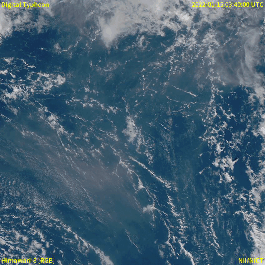
Meteorological satellites are geostationary, which means that they follow the rotation of the earth and therefore appear as if they are in a fixed position in the sky. Geostationary satellites are typically placed at an altitude of 35,800 kilometers, compared to only 500-600 kilometers of polar orbiting satellites. A satellite like the Himawari 8 can obtain images e.g. every 10 minutes, which is not what we will be dealing with now (sorry to disappoint).
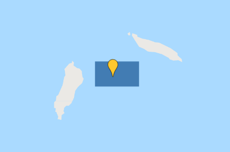
The first thing to do in Google Earth Engine is to get the location of the event. In this case, it is the Hunga Tonga–Hunga Ha’apai volcano in the southern Pacific Ocean.
I create a geometry point at approximately (-175.39, -20.55), which roughly corresponds to where the volcano is located. I also create a polygon, which I will use to search for satellite images that overlap the area.
Now let’s hunt for satellite images!
The two Earth Observation satellite programmes that I am most familiar with are Landsat and Sentinel, so let’s focus on those.
- Landsat 9 (~30m spatial resolution)
- Sentinel 2 (~10m spatial resolution)
I want to start by getting an idea of what the volcano looked like before the eruption. Let’s get a nice, cloud-free image from both satellite programmes.
Since Landsat 9 was launched in September 2021, I will use data from Landsat 8 instead for this pre-eruption image. I will set the cloud cover to a maximum of 20% to keep the image as clear as possible:
var l8_2021 = ee.ImageCollection('LANDSAT/LC08/C02/T1_TOA')
                  .filterDate('2021-01-01', '2022-01-01')
                  .filterBounds(geometry)
                  .filter(ee.Filter.lt('CLOUD_COVER_LAND', 20));
var l8_2021 = l8_2021.select(['B2','B3','B4'], ['B2','B3','B4'])
print(l8_2021, 'Landsat 8 (2021 average)');

var visualisation_l8 = {
  bands: ['B4', 'B3', 'B2'],
  min: 0.01,
  max: 0.2,
};

Map.addLayer(l8_2021.mean(), visualisation_l8, 'Landsat 8 2021')
Let’s do the same for Sentinel 2:
var s2_2021 = ee.ImageCollection('COPERNICUS/S2')
                  .filterDate('2021-01-01', '2022-01-01')
                  .filterBounds(geometry)
                  .filter(ee.Filter.lt('CLOUDY_PIXEL_PERCENTAGE', 5));

var s2_2021 = s2_2021.select(['B2','B3','B4'], ['B2','B3','B4'])
print(s2_2021, 'Sentinel 2 (2021 average)');

var visualisation_s2 = {
  min: 600,
  max: 2000,
  bands: ['B4', 'B3', 'B2'],
};

Map.addLayer(s2_2021.mean(), visualisation_s2, 'Sentinel 2 2021');
Note that I set the cloud cover to only 5% for the Sentinel 2 images. I allow myself to set it that low, because there are much more images available than in the Landsat collection.
Here are the resulting images:
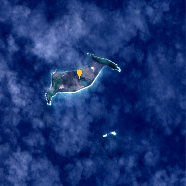
whereas the Sentinel 2 (right) is based on the average of 20 images.
From this comparison I think it is quite clear that the Sentinel 2 images have a higher spatial resolution than the Landsat 9 images.
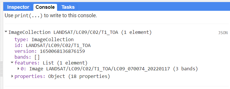
Now we know the situation before the eruption. Next we need to find out if there was a satellite passing over the volcano on the day of the eruption, or at least closely after. First, let’s have a look at the newly launched Landsat 9:
var l9 = ee.ImageCollection('LANDSAT/LC09/C02/T1_TOA')
                  .filterDate('2022-01-15', '2022-01-20')
                  .filterBounds(geometry);
var l9 = l9.select(['B2','B3','B4'], ['B2','B3','B4'])
print(l9, 'Landsat 9 (eruption)');
From the print-statement I can see that there is a single image from Landsat 9 available, from January 17th:
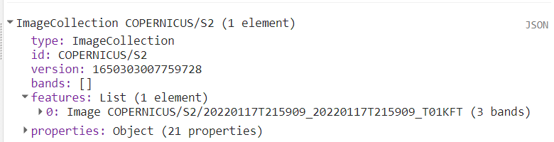
Let’s do the same for Sentinel 2:
var s2 = ee.ImageCollection('COPERNICUS/S2')
                  .filterDate('2022-01-15', '2022-01-20')
                  .filterBounds(geometry);

var s2 = s2.select(['B2','B3','B4'], ['B2','B3','B4'])
print(s2, 'Sentinel 2 (eruption)');
Here I also only get a single image, also from January 17th:
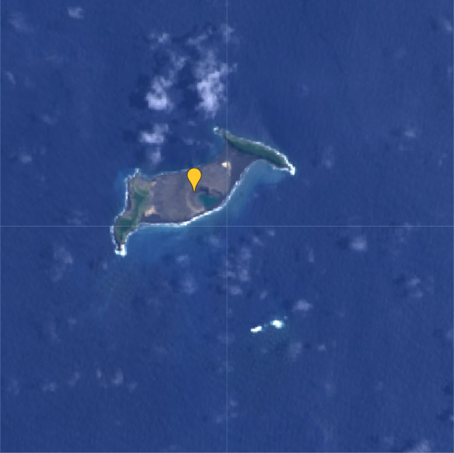
Luckily, both images are fairly cloud free, so we are able to see what remains of the island after the volcanic eruption two days prior:
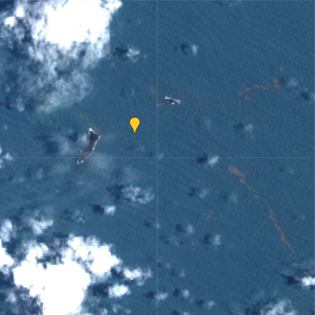
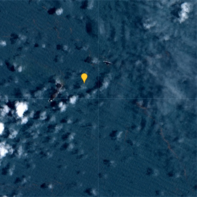
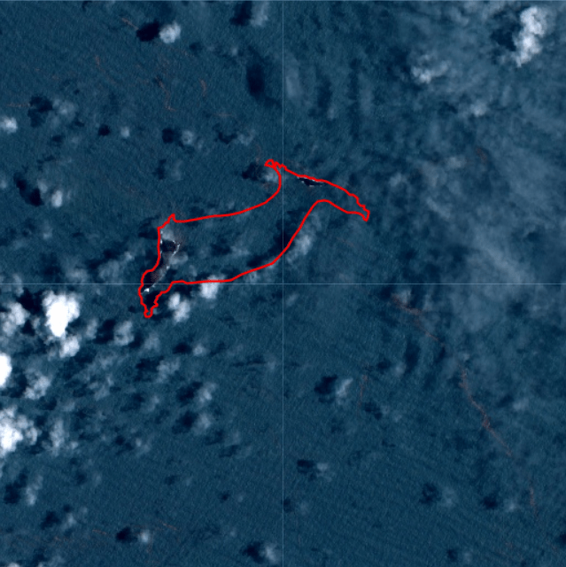
When comparing one of the images from January 17th to the average from 2021, it becomes evident that almost the entire island has disappeared as a result of the eruption:


I drew a polygon to make the difference more clear in the post-eruption image:
According to an estimate by NASA’s Earth Observatory, the eruption of Hunga Tonga–Hunga Ha’apai “released hundreds of times the equivalent mechanical energy of the Hiroshima nuclear explosion”. The plume from the eruption rose to 58 kilometers, making it the largest known volcanic plume measured by satellites.
You can find the Google Earth Engine code here.