Rectangles are the most common shape of maps in GIS software, but why stop there?
In GIS software like ArcGIS Pro, it is possible to create map layouts in non-rectangular shapes without too much hassle. But that is not the case in QGIS (yet!), so let’s look at ways to make creative map shapes in QGIS.
In this post, I explain how to download a Sentinel 2 image from the Copernicus Open Access Hub. I want to use this image to make some unique map-layouts.
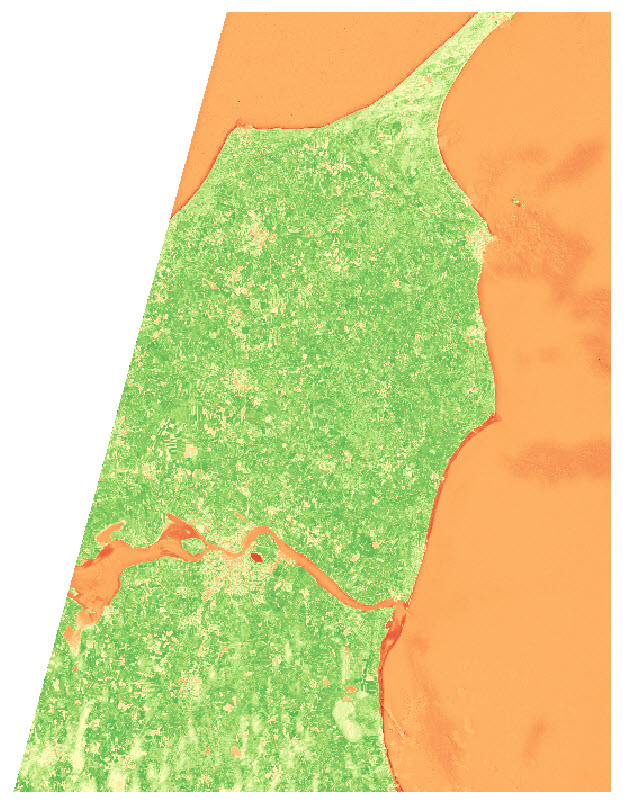
I want to make an NDVI map, so I take the NIR and Red bands from the image (band 8 and 4), add them to QGIS, and use the Raster Calculator to make an NDVI image
I use the latest country-border polygon from GADM to clip the raster layer
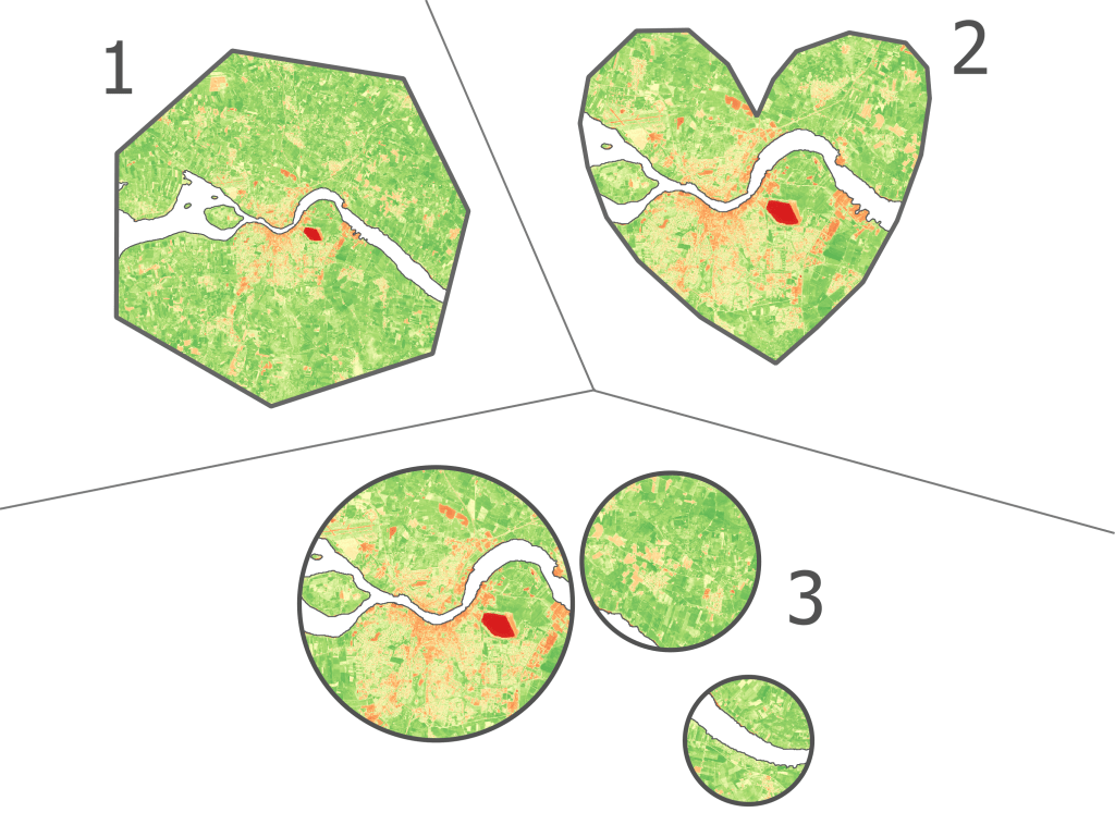
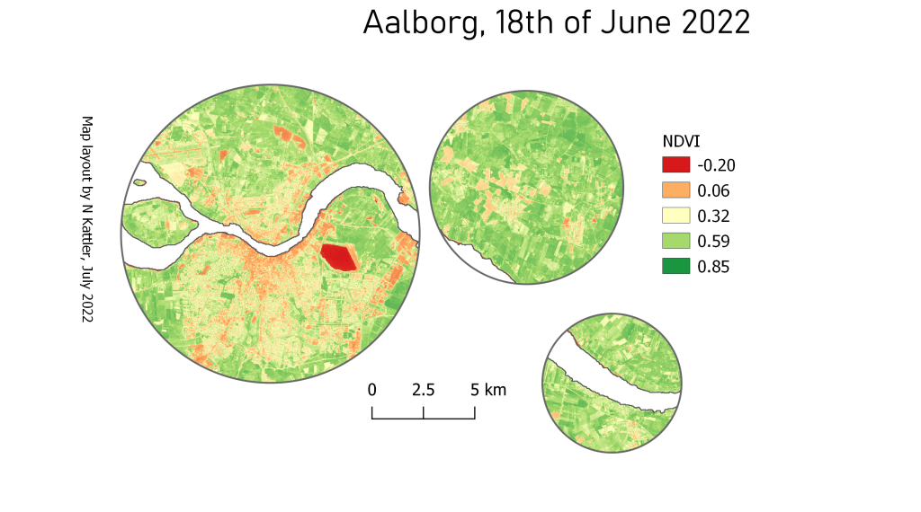
I want to show the NDVI data of the area near the city of Aalborg, in some different shapes.
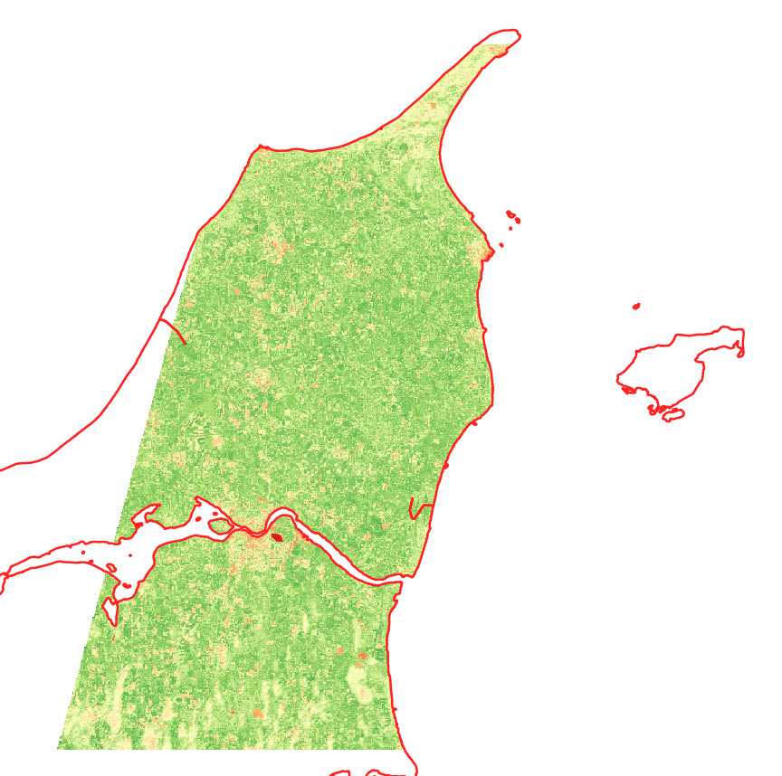
I start by creating two polygon layers, and create a big polygon in one layer and a small polygon (near Aalborg) in the second layer . The small polygon is the one that will define the layout, so get creative!
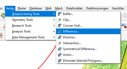
I use the Difference tool in QGIS to cut out the shape of the small polygon in the large polygon.
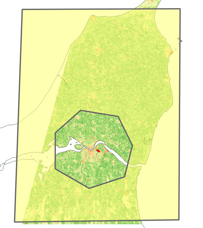
The outcome looks something like this:
Depending on your creative skills, you can make some cool shapes. You can also import a pre-made polygon and use that instead.
Here are the 3 versions I ended up with:
You can also add some of the classical map elements
Personally I don’t find the Copernicus Open Access Hub very intuitive to use, so I wanted to provide an example of how I download data from the website.
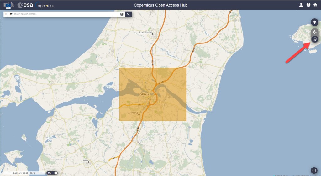
For this example I want to download a single Sentinel 2 (A or B) image from the northern part of Jutland in Denmark. I want it to be cloud free and it should be as recent as possible.
2. Click on “Switch to Navigation Mode” in order to select the area that you are interested in
3. Select the area
4. Click on the filter-button left of the search bar, and make the following selections:
Select Sort by : Sensing date
Select the time period you are interested in (choose Sensing period)
Select the Sentinel satellite mission you want data from Tip: If e.g. you just want any image from Sentinel 2, you don’t have to select anything in the Satellite platform dropdown, just leave it empty.
Select cloud cover % if that is relevant. For Sentinel 2, I usually set the cloud cover very low, e.g. “[0 to 10]”.
5. Click on the search symbol in the top, and you should see a list of available images from your area. If you don’t see any images, try to change the cloud cover or expand the selected time period.
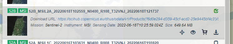
6. Select the image that suits your needs and download it. The download might take a while. The most recent image I downloaded took ~3 min to download and the size was ~0.6GB.
How a filter could look like
The image I ended up selecting
Once the download is finished, the next challenge is to find the raster files in the labyrinth of subfolders. I found mine here:
For this example I will use data from publicly available polar orbiting satellites. These kind of satellites only take a single image of an area, and returns to that area perhaps a week later. So it is pretty unlikely that one of these satellites passed by at the exact time of the eruption, but I hope to find some before-and-after shots.
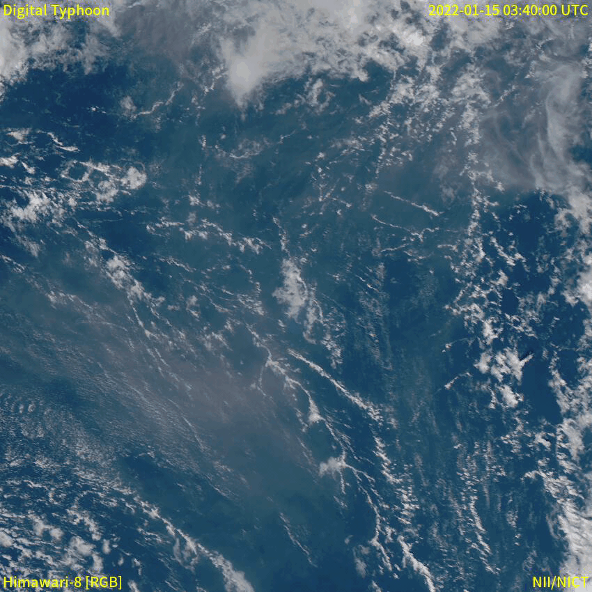
Now, you might have seen incredible images of events like the Tonga eruption. Here is a gif of the Japanese meteorological satellite Himawari 8:
From the Japanese National Institute of Informatics (link)
Meteorological satellites are geostationary, which means that they follow the rotation of the earth and therefore appear as if they are in a fixed position in the sky. Geostationary satellites are typically placed at an altitude of 35,800 kilometers, compared to only 500-600 kilometers of polar orbiting satellites. A satellite like the Himawari 8 can obtain images e.g. every 10 minutes, which is not what we will be dealing with now (sorry to disappoint).
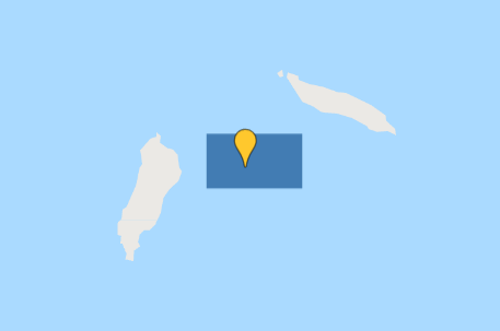
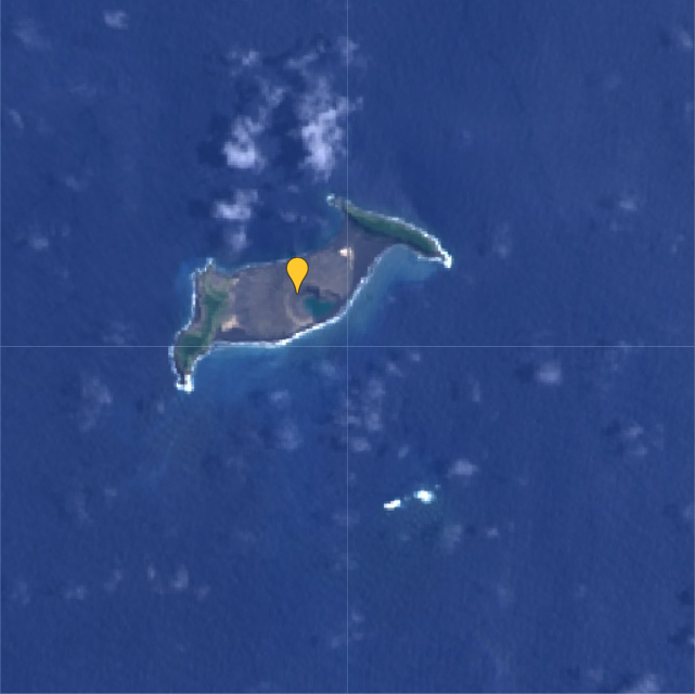
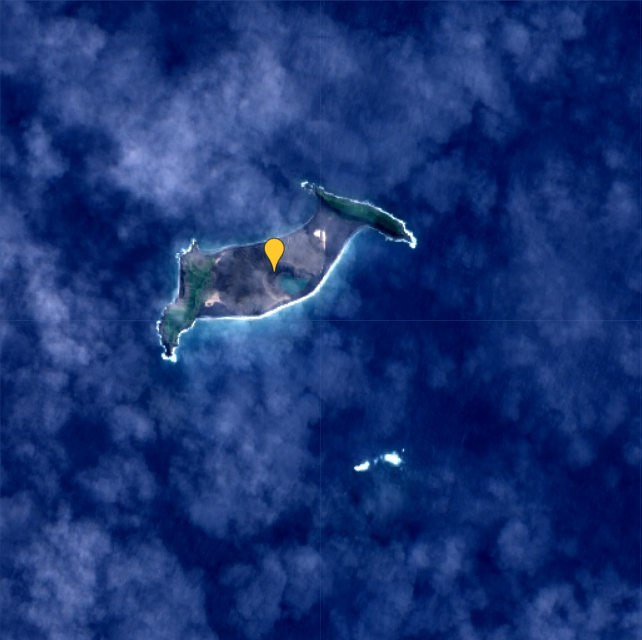
The first thing to do in Google Earth Engine is to get the location of the event. In this case, it is the Hunga Tonga–Hunga Ha’apai volcano in the southern Pacific Ocean.
I create a geometry point at approximately (-175.39, -20.55), which roughly corresponds to where the volcano is located. I also create a polygon, which I will use to search for satellite images that overlap the area.
Point and polygon are in place
Now let’s hunt for satellite images!
The two Earth Observation satellite programmes that I am most familiar with are Landsat and Sentinel, so let’s focus on those.
I want to start by getting an idea of what the volcano looked like before the eruption. Let’s get a nice, cloud-free image from both satellite programmes.
Since Landsat 9 was launched in September 2021, I will use data from Landsat 8 instead for this pre-eruption image. I will set the cloud cover to a maximum of 20% to keep the image as clear as possible:
Note that I set the cloud cover to only 5% for the Sentinel 2 images. I allow myself to set it that low, because there are much more images available than in the Landsat collection.
Here are the resulting images:
The Landsat 8 (left) is comprised of the average of 3 images, whereas the Sentinel 2 (right) is based on the average of 20 images.
From this comparison I think it is quite clear that the Sentinel 2 images have a higher spatial resolution than the Landsat 9 images.
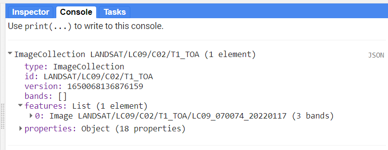
Now we know the situation before the eruption. Next we need to find out if there was a satellite passing over the volcano on the day of the eruption, or at least closely after. First, let’s have a look at the newly launched Landsat 9:
var l9 = ee.ImageCollection('LANDSAT/LC09/C02/T1_TOA')
                  .filterDate('2022-01-15', '2022-01-20')
                  .filterBounds(geometry);
var l9 = l9.select(['B2','B3','B4'], ['B2','B3','B4'])
print(l9, 'Landsat 9 (eruption)');
From the print-statement I can see that there is a single image from Landsat 9 available, from January 17th:
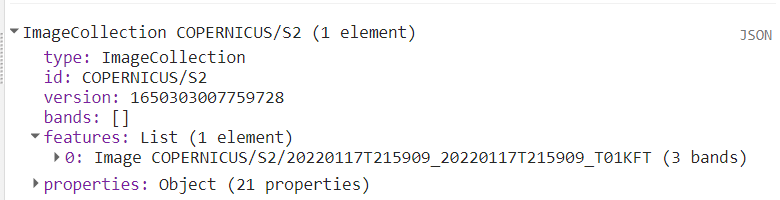
Let’s do the same for Sentinel 2:
var s2 = ee.ImageCollection('COPERNICUS/S2')
                  .filterDate('2022-01-15', '2022-01-20')
                  .filterBounds(geometry);

var s2 = s2.select(['B2','B3','B4'], ['B2','B3','B4'])
print(s2, 'Sentinel 2 (eruption)');
Here I also only get a single image, also from January 17th:
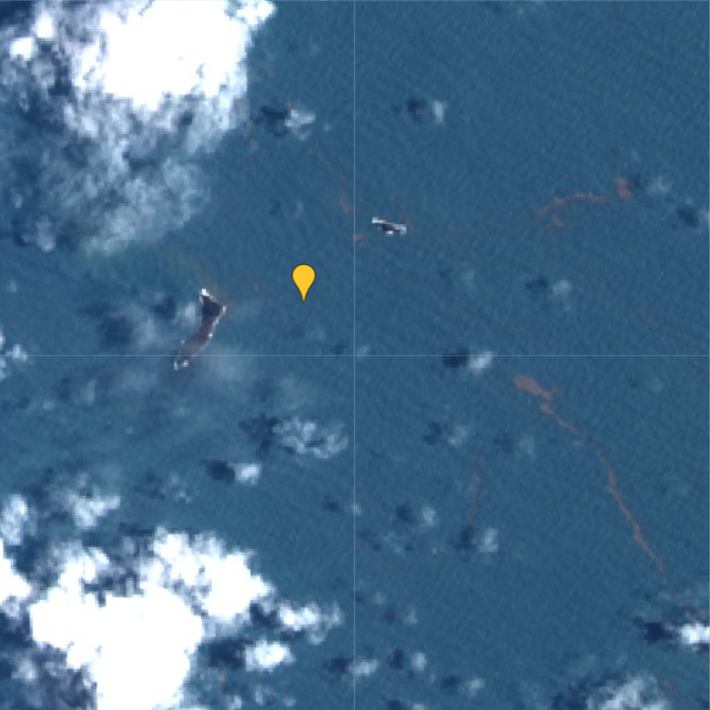
Luckily, both images are fairly cloud free, so we are able to see what remains of the island after the volcanic eruption two days prior:
Landsat 9 (left) and Sentinel 2 (right) on January 17 2022, two days after the eruption.
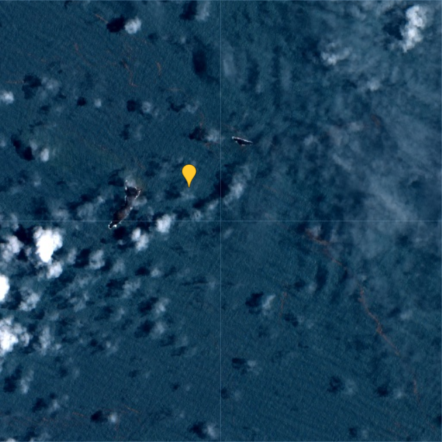
When comparing one of the images from January 17th to the average from 2021, it becomes evident that almost the entire island has disappeared as a result of the eruption:
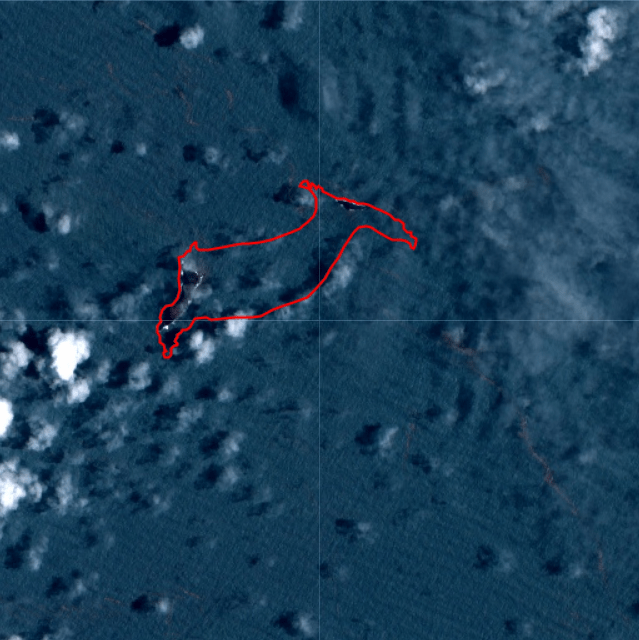
I drew a polygon to make the difference more clear in the post-eruption image:
In a previous post, I use a similar script to calculate NDVI per polygon. However, this script includes a small difference which I have not yet myself understood why it was necessary.
As before, my shapefile consists of the administrative borders of Tanzania. I got this shapefile from the GADM database (version 3.6).
// Import administrative borders and select the gadm level
// (0=country, 1=region, 2=district, 3=ward)
var gadm_level = '2';
var fc_oldID = ee.FeatureCollection('users/username/gadm36_TZA_'+gadm_level);
Map.addLayer(fc, {}, 'gadm TZA');
Map.centerObject(fc, 6);
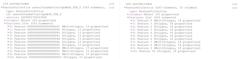
Now I change the system:index of the FeatureCollection.
Why do this at all? I was struggling to produce a mean value of the COPERNICUS landcover data, after having created a successful script for the MODIS NDVI dataset. When I ran the script, no mean column was created. However, I was able to calculate mean values from a couple of polygons that I created myself within Google Earth Engine, so I knew the problem had to be in the shapefile somehow. So I started to investigate the gadm asset (i.e. the shapefile) and saw that Google Earth Engine automatically assigns some odd index names to each feature (e.g. 000000000001 or 0000000000a). I used the following steps described by the user Kuik on StackExchange to change the system:index:
// Change the system:index ("ID")

var idList = ee.List.sequence(0,fc_oldID.size().subtract(1));

var list = fc_oldID.toList(fc_oldID.size());

var fc = ee.FeatureCollection(idList.map(function(newSysIndex){
  var feat = ee.Feature(list.get(newSysIndex));
  var indexString = ee.Number(newSysIndex).format('%01d');
  return feat.set('system:index', indexString, 'ID', indexString);
}));

print('new system:index', fc);
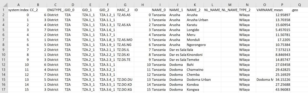
Now you can see that the system:index has been changed:
Now I load in the landcover data. Here I use the 100m resolution, yearly Copernicus Global Land Cover dataset. Here we can find an image per year from 2015-2019. This dataset has a long list of interesting bands, e.g. a land cover classification with 23 categories, percentage of urban areas and percentage of cropland. In this script, I will look at the percentage of cropland (crops-coverfraction) for different administrative regions in Tanzania. Read more about the COPERNICUS dataset here.
// Load data
var year = '2015'
var lc = ee.Image("COPERNICUS/Landcover/100m/Proba-V-C3/Global/"+year)
.select('crops-coverfraction')
.clip(fc)
print('Image from '+year, lc)
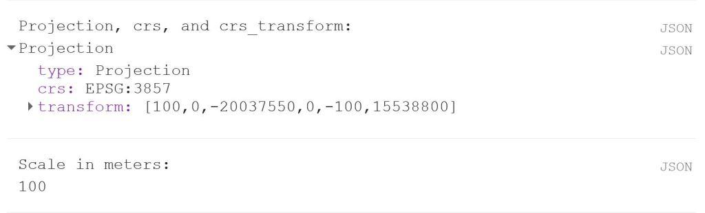
print('Projection, crs, and crs_transform:', lc.projection());
print('Scale in meters:', lc.projection().nominalScale());
The last two lines is a good way to get a bit more information about your data if you, like I was, are looking for a reason why your script is misbehaving. It will give you the following output: