Solving a “gaps and islands” problem using LAG [SQL]

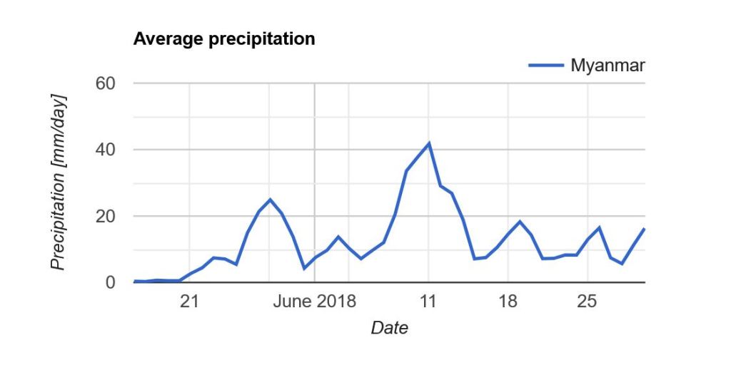
At my work, we have a lot with sensors installed all over the city, which take measurements at certain intervals, e.g. once per minute. For example, a water sensor, which every minute measures the current level of rain water in an underground basin.

Most of the time the sensor will measure zero amount of water. So our dataset can look something like this, during a day with a couple of showers:

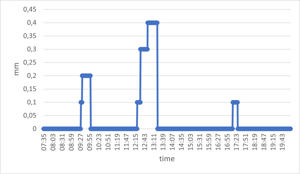
The water sensor works as a tipping bucket; it reports the amount of water in the bucket, and after a while it will empty the bucket. This means that the mm of water represents the total, accumulated amount of water in the bucket. As such, you will never see the amount decreasing; it will go from the max value to zero.

I am interested in understanding two things:
1. How many rain events occur per day
2. How much water is registered in each rain event

My data is stored in a PostgreSQL database (version 13). First, let’s define the data I have available:

Column nameData type
sensor_idvarchar
timestamptimestamp
no_measurementint
valuenumeric

Here’s an example of what the data can look like:

sensor_idtimestampno_measurementvalue
SPILD_SIFIX012023-07-03 07:35:00.00010
SPILD_SIFIX012023-07-03 07:36:00.00020
SPILD_SIFIX012023-07-03 07:37:00.00030.1
SPILD_SIFIX012023-07-03 07:38:00.00040
SPILD_SIFIX012023-07-03 07:39:00.00050.1
SPILD_SIFIX012023-07-03 07:40:00.00060.2
SPILD_SIFIX012023-07-03 07:41:00.00070
SPILD_SIFIX012023-07-03 07:42:00.00080
SPILD_SIFIX012023-07-03 07:43:00.00090.2
SPILD_SIFIX012023-07-03 07:44:00.000100.4
SPILD_SIFIX012023-07-03 07:45:00.000110.4

The first problem I need to solve is how to isolate rain events and figure out if a rain event has occurred over multiple measurements (aka through time).

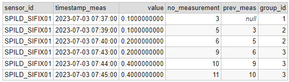
By removing the zeros, I get the rain events. But how do I figure out whether a rain event continues over multiple measurements? My solution is to use the LAG function. This function looks backwards 1 row (1 is the default, it can be set to any amount of rows) and gives you the value of that row for a specific column. I can use this function, because I am given a measurement count column (“no_measurement”). This means that any concurrent measurement will have a no_measurement value the same as the previous + 1.

For example, a rain event is recorded with no_measurement = 8. If this measurement is part of a continuing rain event, the previous measurement should have no_measurement = 7 if it is the same rain event.

SELECT *,
  LAG(no_measurement) OVER(ORDER BY no_measurement) AS prev_meas
  FROM MyTable 
WHERE value!= 0::numeric
ORDER BY no_measurement

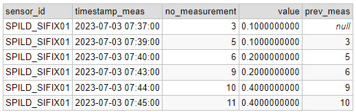
Now I have the expected previous no_measurement. Next step is to group the rain events (with a unique ID per group), by checking if the previous no_measurement fits with the current:

SELECT 
  sensor_id, 
  timestamp_meas, 
  value, 
  no_measurement,
  prev_meas,
  CASE WHEN m.prev_meas = no_measurement - 1 THEN currval('seq') ELSE nextval('seq') END AS group_id
FROM 
(SELECT *,  
  LAG(no_measurement) OVER(ORDER BY no_measurement) AS prev_meas
  FROM MyTable 
WHERE value != 0::numeric
ORDER BY no_measurement) m

Note that I am using a function called CURRVAL and NEXTVAL to give the groups a unique ID. I create a temporary sequence (called “seq”) from which I can get a unique ID using the CURRVAL/NEXTVAL. You create the sequence like this:

CREATE TEMPORARY SEQUENCE seq START 1;

Now I have given the 3 rain events unique IDs:

The final step is to use GROUP BY on the date, group_id, take the maximum measured value (because it is an accumulated value), add a start and end timestamp and calculate the duration of each event.

SELECT 
  DATE(timestamp_meas) AS date,
  sensor_id, 
  group_id, 
  ROUND(MAX(value),2) AS mm_in_total, 
  MIN(timestamp_meas) rain_start, 
  MAX(timestamp_meas) rain_end, 
  (EXTRACT(HOUR FROM MAX(timestamp_meas))-EXTRACT(HOUR FROM MIN(timestamp_meas))) AS duration_hour,
  (EXTRACT(MINUTE FROM MAX(timestamp_meas))-EXTRACT(MINUTE FROM MIN(timestamp_meas))) AS duration_minute
FROM (
  SELECT 
  sensor_id, 
  timestamp_meas, 
  value, 
  no_measurement, 
  prev_meas,
  CASE WHEN m.prev_meas = no_measurement - 1 THEN CURRVAL('seq') ELSE NEXTVAL('seq') END AS group_id
FROM 
(SELECT *, 
  LAG(no_measurement) OVER(ORDER BY no_measurement) AS prev_meas
  FROM MyTable 
WHERE value != 0::numeric
ORDER BY no_measurement) m) t
GROUP BY DATE(timestamp_meas), sensor_id, group_id
ORDER BY group_id

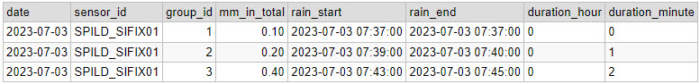
Reflecting on this solution, this query could also have been written as a CTE (common table expression), which I think would have made the query more readable. Here’s a nice example of such a solution.

How to make a non-rectangular map layout in QGIS

Rectangles are the most common shape of maps in GIS software, but why stop there?

In GIS software like ArcGIS Pro, it is possible to create map layouts in non-rectangular shapes without too much hassle. But that is not the case in QGIS (yet!), so let’s look at ways to make creative map shapes in QGIS.

In this post, I explain how to download a Sentinel 2 image from the Copernicus Open Access Hub. I want to use this image to make some unique map-layouts.

I want to make an NDVI map, so I take the NIR and Red bands from the image (band 8 and 4), add them to QGIS, and use the Raster Calculator to make an NDVI image

I use the latest country-border polygon from GADM to clip the raster layer

I want to show the NDVI data of the area near the city of Aalborg, in some different shapes.

I start by creating two polygon layers, and create a big polygon in one layer and a small polygon (near Aalborg) in the second layer . The small polygon is the one that will define the layout, so get creative!

I use the Difference tool in QGIS to cut out the shape of the small polygon in the large polygon.

The outcome looks something like this:

Depending on your creative skills, you can make some cool shapes. You can also import a pre-made polygon and use that instead.

Here are the 3 versions I ended up with:

You can also add some of the classical map elements

How to download a satellite image from Copernicus Open Access Hub

Personally I don’t find the Copernicus Open Access Hub very intuitive to use, so I wanted to provide an example of how I download data from the website.

For this example I want to download a single Sentinel 2 (A or B) image from the northern part of Jutland in Denmark. I want it to be cloud free and it should be as recent as possible.

Here’s how I would do that:

1. Login to Copernicus Open Access Hub by clicking the confused looking person in the top right corner

2. Click on “Switch to Navigation Mode” in order to select the area that you are interested in

3. Select the area

4. Click on the filter-button left of the search bar, and make the following selections:

  • Select Sort by : Sensing date
  • Select the time period you are interested in (choose Sensing period)
  • Select the Sentinel satellite mission you want data from
    Tip: If e.g. you just want any image from Sentinel 2, you don’t have to select anything in the Satellite platform dropdown, just leave it empty.
  • Select cloud cover % if that is relevant. For Sentinel 2, I usually set the cloud cover very low, e.g. “[0 to 10]”.

5. Click on the search symbol in the top, and you should see a list of available images from your area.
If you don’t see any images, try to change the cloud cover or expand the selected time period.

6. Select the image that suits your needs and download it.
The download might take a while. The most recent image I downloaded took ~3 min to download and the size was ~0.6GB.

How a filter could look like

The image I ended up selecting

Once the download is finished, the next challenge is to find the raster files in the labyrinth of subfolders. I found mine here:

C:\Users\username\Downloads\S2B_MSIL2A_20220618T102559_N0400_R108_T32VNJ_20220618T121737\S2B_MSIL2A_20220618T102559_N0400_R108_T32VNJ_20220618T121737.SAFE\GRANULE\L2A_T32VNJ_A027590_20220618T102602\IMG_DATA

Here you can find three resolutions folders (R10m, R20m, R60m). In my case I chose R10m.

The data is in the JP2-format, which a program like QGIS should not have any problem reading.

That’s it — good luck with downloading data on your own!

If you want to see what I used the sentinel image for, you can read about it in this post.

How to find a specific satellite image in Google Earth Engine

Let’s say there is a specific spatial event that you are interested in, for example the volcanic eruption in Tonga on January 15th in 2022.

For this example I will use data from publicly available polar orbiting satellites. These kind of satellites only take a single image of an area, and returns to that area perhaps a week later. So it is pretty unlikely that one of these satellites passed by at the exact time of the eruption, but I hope to find some before-and-after shots.

Now, you might have seen incredible images of events like the Tonga eruption. Here is a gif of the Japanese meteorological satellite Himawari 8:

From the Japanese National Institute of Informatics (link)

Meteorological satellites are geostationary, which means that they follow the rotation of the earth and therefore appear as if they are in a fixed position in the sky. Geostationary satellites are typically placed at an altitude of 35,800 kilometers, compared to only 500-600 kilometers of polar orbiting satellites. A satellite like the Himawari 8 can obtain images e.g. every 10 minutes, which is not what we will be dealing with now (sorry to disappoint).

The first thing to do in Google Earth Engine is to get the location of the event. In this case, it is the Hunga Tonga–Hunga Ha’apai volcano in the southern Pacific Ocean.

I create a geometry point at approximately (-175.39, -20.55), which roughly corresponds to where the volcano is located. I also create a polygon, which I will use to search for satellite images that overlap the area.

Point and polygon are in place

Now let’s hunt for satellite images!

The two Earth Observation satellite programmes that I am most familiar with are Landsat and Sentinel, so let’s focus on those.

I want to start by getting an idea of what the volcano looked like before the eruption. Let’s get a nice, cloud-free image from both satellite programmes.

Since Landsat 9 was launched in September 2021, I will use data from Landsat 8 instead for this pre-eruption image. I will set the cloud cover to a maximum of 20% to keep the image as clear as possible:

var l8_2021 = ee.ImageCollection('LANDSAT/LC08/C02/T1_TOA')
                  .filterDate('2021-01-01', '2022-01-01')
                  .filterBounds(geometry)
                  .filter(ee.Filter.lt('CLOUD_COVER_LAND', 20));
var l8_2021 = l8_2021.select(['B2','B3','B4'], ['B2','B3','B4'])
print(l8_2021, 'Landsat 8 (2021 average)');

var visualisation_l8 = {
  bands: ['B4', 'B3', 'B2'],
  min: 0.01,
  max: 0.2,
};

Map.addLayer(l8_2021.mean(), visualisation_l8, 'Landsat 8 2021')

Let’s do the same for Sentinel 2:

var s2_2021 = ee.ImageCollection('COPERNICUS/S2')
                  .filterDate('2021-01-01', '2022-01-01')
                  .filterBounds(geometry)
                  .filter(ee.Filter.lt('CLOUDY_PIXEL_PERCENTAGE', 5));

var s2_2021 = s2_2021.select(['B2','B3','B4'], ['B2','B3','B4'])
print(s2_2021, 'Sentinel 2 (2021 average)');

var visualisation_s2 = {
  min: 600,
  max: 2000,
  bands: ['B4', 'B3', 'B2'],
};

Map.addLayer(s2_2021.mean(), visualisation_s2, 'Sentinel 2 2021');

Note that I set the cloud cover to only 5% for the Sentinel 2 images. I allow myself to set it that low, because there are much more images available than in the Landsat collection.

Here are the resulting images:

The Landsat 8 (left) is comprised of the average of 3 images,
whereas the Sentinel 2 (right) is based on the average of 20 images.

From this comparison I think it is quite clear that the Sentinel 2 images have a higher spatial resolution than the Landsat 9 images.

Now we know the situation before the eruption. Next we need to find out if there was a satellite passing over the volcano on the day of the eruption, or at least closely after. First, let’s have a look at the newly launched Landsat 9:

var l9 = ee.ImageCollection('LANDSAT/LC09/C02/T1_TOA')
                  .filterDate('2022-01-15', '2022-01-20')
                  .filterBounds(geometry);
var l9 = l9.select(['B2','B3','B4'], ['B2','B3','B4'])
print(l9, 'Landsat 9 (eruption)');

From the print-statement I can see that there is a single image from Landsat 9 available, from January 17th:

Let’s do the same for Sentinel 2:

var s2 = ee.ImageCollection('COPERNICUS/S2')
                  .filterDate('2022-01-15', '2022-01-20')
                  .filterBounds(geometry);

var s2 = s2.select(['B2','B3','B4'], ['B2','B3','B4'])
print(s2, 'Sentinel 2 (eruption)');

Here I also only get a single image, also from January 17th:

Luckily, both images are fairly cloud free, so we are able to see what remains of the island after the volcanic eruption two days prior:

Landsat 9 (left) and Sentinel 2 (right) on January 17 2022, two days after the eruption.

When comparing one of the images from January 17th to the average from 2021, it becomes evident that almost the entire island has disappeared as a result of the eruption:

I drew a polygon to make the difference more clear in the post-eruption image:

According to an estimate by NASA’s Earth Observatory, the eruption of Hunga Tonga–Hunga Ha’apai “released hundreds of times the equivalent mechanical energy of the Hiroshima nuclear explosion”. The plume from the eruption rose to 58 kilometers, making it the largest known volcanic plume measured by satellites.

You can find the Google Earth Engine code here.

Visualising the age of buildings: Copenhagen [QGIS]

Through the exellent newsletter quantum of sollazzo by Giuseppe Sollazzo (@puntofisso) I learned of the beautiful map of Paris by Naresh Suglani (@SuglaniNaresh), where Suglani have visualised the year of construction in a lovely blue-to-red colour gradient. It is a stunning visualisation, and I immediately wanted to try to make a similar version myself.

Here you can see Suglani’s original:

“Paris | Building Ages” by Naresh Suglani. September 2021.

In order to recreate this map I needed to get my hands on 1) the shapes of buildings in Copenhagen and 2) the year of construction.

The shape of buildings

Dataforsyningen is part of the Danish Agency for Data Supply and Efficiency, and they offer a range of datasets. One of them is the dataset INSPIRE – Bygninger. This dataset follows the INSPIRE directive by the European Union, which promotes the standardisation of the infrastructure for geographical data in Europe. The file contains polygons of the shape of buildings, which is what I needed. The file format is GML, which you can read about here.

This is a rather big file, because it is not possible to filter which part of Denmark you are interested in.

The age of the buildings

Unfortunately, the GML file does not contain a “date of construction” attribute, so I had to find that elsewhere.

From my current workplace, I know of a dataset called “BBR”, which stands for Bygnings- og Boligregistret (Building- and Housing Registry). This dataset contains information about housing plots, buildings, facilities etc. in a point format. I had a strong suspicion that BBR includes information about the year of construction, so I downloaded the dataset from Dataforsyningen, just like the buildings-dataset. This dataset is called INSPIRE – BBR bygninger og boliger, and comes in the geopackage file format (.gpkg).

Once again, we get a rather large file:

I open the file and — we are in luck! The point-file contains an attribute called “dateofcons” aka date of construction.

However, one thing stood out: Several buildings had the date of construction as the year 1000. Now I am no history major, but that seemed like a bit of a stretch. So I asked around, and it turns out that the BBR-dataset use the value 1000 as their “unknown” category. Not the most ideal choice in my opinion, but that’s how it is. Therefore I had to filter out the 1000-values in the dateofcons column for my visualisation.

Clipping the data

To follow the design of Suglani, I focused on central Copenhagen. I created a circular polygon encompassing most of the old town of central Copenhagen to use to clip the two datasets.

Then I was ready to clip the data to fit my circle:

And here are the results:

Building polygons to the left, BBR points on the right.

Next I needed to join the two datasets somehow, so that each building could have an attribute with its year of construction. For this I needed to do a join attributes by location.

By doing this kind of join I assumed that both datasets are near-perfect, i.e. that all buildings are registered at a high level of detail, and that the position of the BBR-points will not fall out of the building polygons. That is a large assumption to make, and there will probably be some errors. Let’s have a closer look at how well the two datasets match:

I would say this is an excellent fit, although there is at least one BBR-point which seems to be floating in the air, with no building-polygon nearby.

I ran the join tool, waited a few minutes, and voilá!

Not as elegant or interactive as Suglani’s original version, but I’m pretty satisfied!

I also made a light version in Danish:

Using the Attribute Based Clustering plugin [QGIS]

QGIS is not as easy to work with regarding spatial statistics as its commercial counterpart ArcGIS. However, QGIS does have some plugins that can do some great statistical analysis. One example is the Attribute Based Clustering plugin, created by the QGIS-contributor ekazakov.

The logo of the plugin

The plugin creates clusters based on the attributes of a vector layer, not the spatial distribution of the data. The clusters are calculated using either a hierarchical or a k-means algorithm. If you are using the hierarchical clustering, you can define the weight of each attribute that you want to include in the cluster analysis. The higher the weight, the stronger the effect, or impact, the attribute will have on how the clusters are created. You can read more about the plugin on ekazakov’s own website which includes a tutorial of the plugin.

I recorded a video for a GIS course where I give an example on how you can use the plugin, and what the result looks like, using data from Malmö, a city in southern Sweden.

Sorry for the low video quality! I’ll try to explore the settings of the recording software next time.

The data was from Malmö Stad and can be downloaded here as an Excel file. The three attributes that I used were:

  • Amount of people with a longer education (“Eftergymnasial“) in 2019
  • Amount of people with a foreign background (“Utländsk bakgrund“) in 2019. NB: This number includes people born in the country, but where both parents are foreigners.
  • Percentage of the population who are employed (“Förvärvsarbetande“) in 2018

Below you can see the difference between having 3 and 4 clusters, using the same settings otherwise:

3 clusters
4 clusters

SMAP soil moisture data now available at 10km resolution [Google Earth Engine]

I realise that I am a bit late to the party, but I just noticed the paper by Mladenova et al (2020) which outlines a new SMAP-based soil moisture dataset, where the resolution is increased from 0.25°x0.25° (roughly 27-28km at the equator) to 10km by “assimilating soil moisture retrievals from the Soil Moisture Active Passive (SMAP) mission into the USDA-FAS Palmer model“.

The researchers tested the new dataset in three areas: California (USA), the Western Cape (South Africa) and New South Wales (Australia), as all three areas experienced a drought since the SMAP satellite has been operational.

Study areas for the Mladenova et al (2020) paper.
Study area for the Mladenova et al (2020) paper

Soil moisture is an often overlooked dataset, especially due to the often terribly low spatial resolution. Perhaps this enhanced dataset will result in an increased usage of the data. The increased spatial resolution is, in my opinion, a big improvement:

0.25°x0.25° SMAP image compared to the 10x10km enhanced SMAP image.
Here I used Lithuania used an example, with data from 2017-2018.

As you can guess from the two images above, the enhanced dataset is available on Google Earth Engine.

If you want to see the (to my knowledge) only high-resolution soil moisture product in existence, check out the Dutch remote sensing company VanderSat. Their product is based on passive microwaves, and has a spatial resolution of just 100m.

The NASA-USDA soil moisture product generated from the SMAP-enhanced Palmer model can be found here: https://gimms.gsfc.nasa.gov/SMOS/SMAP/.

Time series for SSM, ET and precipitation for Myanmar [Google Earth Engine]

Back in December 2018, I was in Yangon (Myanmar) to help facilitate a workshop on satellite-based remote sensing to support water professionals in the country. For this workshop, I created a script to calculate a time series for surface soil moisture, evapotranspiration and precipitation.

The data for this script are:

The first thing to do is to load the shapefile of Myanmar, using the LSIB dataset. We need to deal with the auto generated system:index, which otherwise causes some visualisation issues later on. The auto generated ID for the Feature could be something like 000000000000000092.

My solution is a bit of a ‘hack’, because in this specific case, I only have a single Feature in my FeatureCollection, i.e. the shapefile of Myanmar. That means that I can use .first() and .set() to change the system:index of the single Feature. In this instance, I change the system:index to Myanmar.

// Select country from list
var countries = ee.FeatureCollection("USDOS/LSIB/2017");
var fc = countries.filter(ee.Filter.inList('COUNTRY_NA',['Burma']));
print('Old system:index', fc);

// Change system:index from the auto generated name
var feature = ee.Feature(fc.first().set('system:index', 'Myanmar')); // .first() is used as there is just one Feature
var Myanmar = ee.FeatureCollection(feature);
print('New system:index', Myanmar);

// Add Myanmar and center map
Map.centerObject(Myanmar);
Map.addLayer(Myanmar, {}, 'Myanmar shapefile');

This gives the following output:

Now I load the imageCollections of the three datasets.

// Filter datasets for bands and period
var SSM = ee.ImageCollection('NASA_USDA/HSL/SMAP_soil_moisture')
      .select('ssm')
      .filterBounds(Myanmar)
      .filterDate(startdate, enddate);

var ET = ee.ImageCollection('MODIS/006/MOD16A2')
      .select('ET')
      .filterBounds(Myanmar)
      .filterDate(startdate, enddate);
      
var PRCP = ee.ImageCollection('UCSB-CHG/CHIRPS/DAILY')
      .select('precipitation')
      .filterBounds(Myanmar)
      .filterDate(startdate, enddate);

Next, I create a single image consisting of the mean of each imageCollection for the given time period. This is purely for visualisation purposes as you will see next.

// Calculate means for visualisation
var SSM_mean = SSM.mean()
  .clip(Myanmar);

var ET_mean = ET.mean()
  .clip(Myanmar);

var PRCP_mean = PRCP.mean()
  .clip(Myanmar);

I set the visualisation parameters, and add the data to my map.

// Set visualisation parameters    
var soilMoistureVis = {
  min: 10.0,
  max: 28.0,
  palette: ['0300ff', '418504', 'efff07', 'efff07', 'ff0303'],
};

var evapotranspirationVis = {
  min: 0.0,
  max: 300.0,
  palette: [
    'ffffff', 'fcd163', '99b718', '66a000', '3e8601', '207401', '056201',
    '004c00', '011301'
  ],
};

var precipitationVis = {
  min: 1.0,
  max: 30.0,
  palette: ['#ffffcc','#a1dab4','#41b6c4','#2c7fb8','#253494'],
};

// Visualize maps
Map.addLayer(SSM_mean, soilMoistureVis, 'SSM');
Map.addLayer(ET_mean, evapotranspirationVis, 'ET');
Map.addLayer(PRCP_mean, precipitationVis, 'PRCP');

That gives us the following output:


Now what we really want is a graph showing the development of the data through time. Due to the limited memory capacity of Google Earth Engine, I can’t get more than 1.5 month of data, but that is enough to have a look at the onset of the monsoon season in May/June.

I use the ui.Chart.image.seriesByRegion where the arguments are: imageCollection, regions, reducer, band, scale, xProperty, seriesProperty (last four are optional). In addition, I use .setOptions() to add a main title and axis titles.

// Define graphs
var SSMGraph = ui.Chart.image.seriesByRegion({
  imageCollection: SSM, 
  regions: Myanmar, 
  band: 'ssm',
  reducer: ee.Reducer.mean(),
  scale: 25000, // 25km resolution
}).setOptions({
        title: 'Average soil moisture',
        hAxis: {title: 'Date'},
        vAxis: {title: 'Soil moisture [mm]'}});
        
var ETGraph = ui.Chart.image.seriesByRegion({
  imageCollection: ET, 
  regions: Myanmar, 
  band: 'ET',
  reducer: ee.Reducer.mean(),
  scale: 500, // 500m resolution
}).setOptions({
        title: 'Average evapotranspiration',
        hAxis: {title: 'Date'},
        vAxis: {title: 'Evapotranspiration [kg/m^2]'}});

var PRCPGraph = ui.Chart.image.seriesByRegion({
  imageCollection: PRCP, 
  regions: Myanmar, 
  band: 'precipitation',
  reducer: ee.Reducer.mean(),
  scale: 5000, // ~5km resolution
}).setOptions({
        title: 'Average precipitation',
        hAxis: {title: 'Date'},
        vAxis: {title: 'Precipitation [mm/day]'}});

// Display graphs
print(SSMGraph);
print(ETGraph);
print(PRCPGraph);

Which gives us the following output:

Note that “Myanmar” appears in the legend of the graph. If we had not changed the system:index in the beginning, you would instead see something like “000000000000000092“.

Link to the entire script: https://code.earthengine.google.com/e9042e4ac5fc902d1ff58da10856965f

Map examples

Here I will post examples of maps and other images that I have created. Feel free to ask about how certain elements were created, and I can make a post about it.

I will update this post when I have new content to show.

English and Danish version of a map showing the year of construction of buildings in the Danish capital, Copenhagen. Created using QGIS 3.10. Read about how I made the map here.
Geological formation that appeared in the VanderSat soil moisture data. Created using QGIS.

Calculate the percentage (%) cropland for each polygon in a shapefile [Google Earth Engine]

In a previous post, I use a similar script to calculate NDVI per polygon. However, this script includes a small difference which I have not yet myself understood why it was necessary.


As before, my shapefile consists of the administrative borders of Tanzania. I got this shapefile from the GADM database (version 3.6).

// Import administrative borders and select the gadm level 
// (0=country, 1=region, 2=district, 3=ward)
var gadm_level = '2';
var fc_oldID = ee.FeatureCollection('users/username/gadm36_TZA_'+gadm_level);
Map.addLayer(fc, {}, 'gadm TZA');
Map.centerObject(fc, 6);

Now I change the system:index of the FeatureCollection.

Why do this at all? I was struggling to produce a mean value of the COPERNICUS landcover data, after having created a successful script for the MODIS NDVI dataset. When I ran the script, no mean column was created. However, I was able to calculate mean values from a couple of polygons that I created myself within Google Earth Engine, so I knew the problem had to be in the shapefile somehow. So I started to investigate the gadm asset (i.e. the shapefile) and saw that Google Earth Engine automatically assigns some odd index names to each feature (e.g. 000000000001 or 0000000000a). I used the following steps described by the user Kuik on StackExchange to change the system:index:

// Change the system:index ("ID")

var idList = ee.List.sequence(0,fc_oldID.size().subtract(1));

var list = fc_oldID.toList(fc_oldID.size());

var fc = ee.FeatureCollection(idList.map(function(newSysIndex){
  var feat = ee.Feature(list.get(newSysIndex));
  var indexString = ee.Number(newSysIndex).format('%01d');
  return feat.set('system:index', indexString, 'ID', indexString);
}));

print('new system:index', fc);

Now you can see that the system:index has been changed:

Now I load in the landcover data. Here I use the 100m resolution, yearly Copernicus Global Land Cover dataset. Here we can find an image per year from 2015-2019. This dataset has a long list of interesting bands, e.g. a land cover classification with 23 categories, percentage of urban areas and percentage of cropland. In this script, I will look at the percentage of cropland (crops-coverfraction) for different administrative regions in Tanzania. Read more about the COPERNICUS dataset here.

// Load data

var year = '2015'
var lc = ee.Image("COPERNICUS/Landcover/100m/Proba-V-C3/Global/"+year)
      .select('crops-coverfraction')
      .clip(fc)

print('Image from '+year, lc)

print('Projection, crs, and crs_transform:', lc.projection());
print('Scale in meters:', lc.projection().nominalScale());

The last two lines is a good way to get a bit more information about your data if you, like I was, are looking for a reason why your script is misbehaving. It will give you the following output:

Now we can use the reducer reduceRegions. Again, remember that the scale should reflect the spatial resolution of the data. In the image above, we can see that the scale is 100 m.

// Reduce regions
var MeansOfFeatures= lc.reduceRegions({
  reducer: ee.Reducer.mean(),
  collection: fc,
  scale: 100,
})

print('gadm mean', ee.Feature(mean.first())) // Test if mean is produced

// Set visualization parameters    
var lcVis = {
  min: 0.0,
  max: 100.0,
  palette: [
    'ffffff', 'fcd163', '99b718', '66a000', '3e8601', '207401', '056201',
    '004c00', '011301'
  ],
};

Map.addLayer(lc, lcVis, 'crop cover (%) '+year)

// Export the featureCollection (table) as a CSV file
Export.table.toDrive({
  collection: MeansOfFeatures,
  description: 'proba_V_C3_TZA_adm'+gadm_level+'_'+year,
  folder: 'GEE output',
  fileFormat: 'CSV'
});

This should give you the following output:


You can find the full script here.