Back in December 2018, I was in Yangon (Myanmar) to help facilitate a workshop on satellite-based remote sensing to support water professionals in the country. For this workshop, I created a script to calculate a time series for surface soil moisture, evapotranspiration and precipitation.
The data for this script are:
- Large Scale International Boundary Polygons (USDOS/LSIB/2017)
- SMAP Global Soil Moisture Data (NASA_USDA/HSL/SMAP_soil_moisture)
- MODIS Net Evapotranspiration, 500m (MODIS/006/MOD16A2)
- CHIRPS global rainfall dataset (UCSB-CHG/CHIRPS/DAILY)
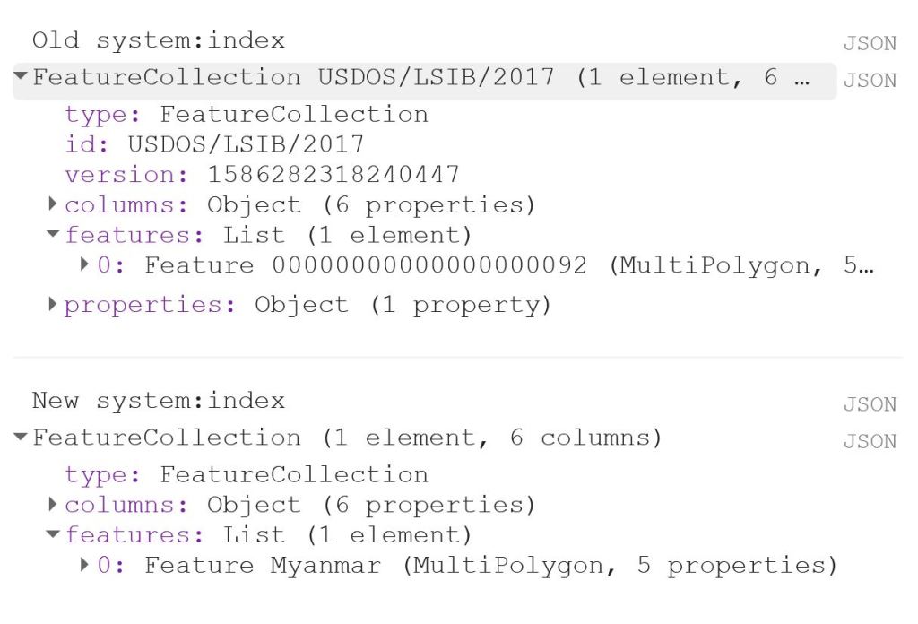
The first thing to do is to load the shapefile of Myanmar, using the LSIB dataset. We need to deal with the auto generated system:index, which otherwise causes some visualisation issues later on. The auto generated ID for the Feature could be something like 000000000000000092.
My solution is a bit of a ‘hack’, because in this specific case, I only have a single Feature in my FeatureCollection, i.e. the shapefile of Myanmar. That means that I can use .first() and .set() to change the system:index of the single Feature. In this instance, I change the system:index to Myanmar.
// Select country from list
var countries = ee.FeatureCollection("USDOS/LSIB/2017");
var fc = countries.filter(ee.Filter.inList('COUNTRY_NA',['Burma']));
print('Old system:index', fc);

// Change system:index from the auto generated name
var feature = ee.Feature(fc.first().set('system:index', 'Myanmar')); // .first() is used as there is just one Feature
var Myanmar = ee.FeatureCollection(feature);
print('New system:index', Myanmar);

// Add Myanmar and center map
Map.centerObject(Myanmar);
Map.addLayer(Myanmar, {}, 'Myanmar shapefile');
This gives the following output:

Now I load the imageCollections of the three datasets.
// Filter datasets for bands and period
var SSM = ee.ImageCollection('NASA_USDA/HSL/SMAP_soil_moisture')
      .select('ssm')
      .filterBounds(Myanmar)
      .filterDate(startdate, enddate);

var ET = ee.ImageCollection('MODIS/006/MOD16A2')
      .select('ET')
      .filterBounds(Myanmar)
      .filterDate(startdate, enddate);

var PRCP = ee.ImageCollection('UCSB-CHG/CHIRPS/DAILY')
      .select('precipitation')
      .filterBounds(Myanmar)
      .filterDate(startdate, enddate);
Next, I create a single image consisting of the mean of each imageCollection for the given time period. This is purely for visualisation purposes as you will see next.
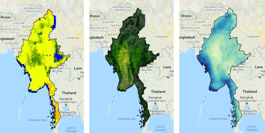
// Calculate means for visualisation
var SSM_mean = SSM.mean()
  .clip(Myanmar);

var ET_mean = ET.mean()
  .clip(Myanmar);

var PRCP_mean = PRCP.mean()
  .clip(Myanmar);
I set the visualisation parameters, and add the data to my map.
// Set visualisation parameters
var soilMoistureVis = {
  min: 10.0,
  max: 28.0,
  palette: ['0300ff', '418504', 'efff07', 'efff07', 'ff0303'],
};

var evapotranspirationVis = {
  min: 0.0,
  max: 300.0,
  palette: [
    'ffffff', 'fcd163', '99b718', '66a000', '3e8601', '207401', '056201',
    '004c00', '011301'
  ],
};

var precipitationVis = {
  min: 1.0,
  max: 30.0,
  palette: ['#ffffcc','#a1dab4','#41b6c4','#2c7fb8','#253494'],
};

// Visualize maps
Map.addLayer(SSM_mean, soilMoistureVis, 'SSM');
Map.addLayer(ET_mean, evapotranspirationVis, 'ET');
Map.addLayer(PRCP_mean, precipitationVis, 'PRCP');
That gives us the following output:
Now what we really want is a graph showing the development of the data through time. Due to the limited memory capacity of Google Earth Engine, I can’t get more than 1.5 month of data, but that is enough to have a look at the onset of the monsoon season in May/June.
I use the ui.Chart.image.seriesByRegion where the arguments are: imageCollection, regions, reducer, band, scale, xProperty, seriesProperty (last four are optional). In addition, I use .setOptions() to add a main title and axis titles.
// Define graphs
var SSMGraph = ui.Chart.image.seriesByRegion({
  imageCollection: SSM,
  regions: Myanmar,
  band: 'ssm',
  reducer: ee.Reducer.mean(),
  scale: 25000, // 25km resolution
}).setOptions({
        title: 'Average soil moisture',
        hAxis: {title: 'Date'},
        vAxis: {title: 'Soil moisture [mm]'}});

var ETGraph = ui.Chart.image.seriesByRegion({
  imageCollection: ET,
  regions: Myanmar,
  band: 'ET',
  reducer: ee.Reducer.mean(),
  scale: 500, // 500m resolution
}).setOptions({
        title: 'Average evapotranspiration',
        hAxis: {title: 'Date'},
        vAxis: {title: 'Evapotranspiration [kg/m^2]'}});

var PRCPGraph = ui.Chart.image.seriesByRegion({
  imageCollection: PRCP,
  regions: Myanmar,
  band: 'precipitation',
  reducer: ee.Reducer.mean(),
  scale: 5000, // ~5km resolution
}).setOptions({
        title: 'Average precipitation',
        hAxis: {title: 'Date'},
        vAxis: {title: 'Precipitation [mm/day]'}});

// Display graphs
print(SSMGraph);
print(ETGraph);
print(PRCPGraph);
Which gives us the following output:
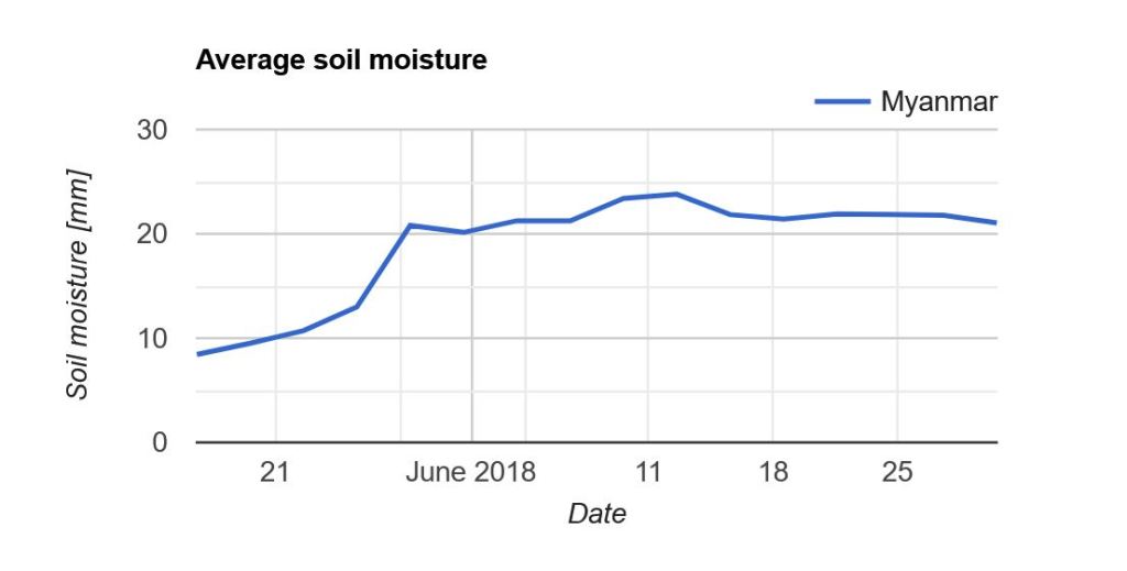
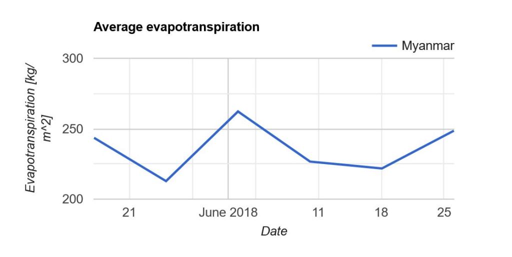
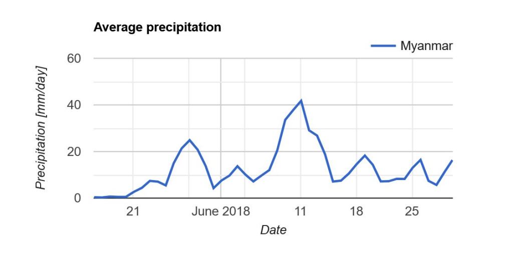
Note that “Myanmar” appears in the legend of the graph. If we had not changed the system:index in the beginning, you would instead see something like “000000000000000092“.
Link to the entire script: https://code.earthengine.google.com/e9042e4ac5fc902d1ff58da10856965f
